plot(ToothGrowth$supp, ToothGrowth$len)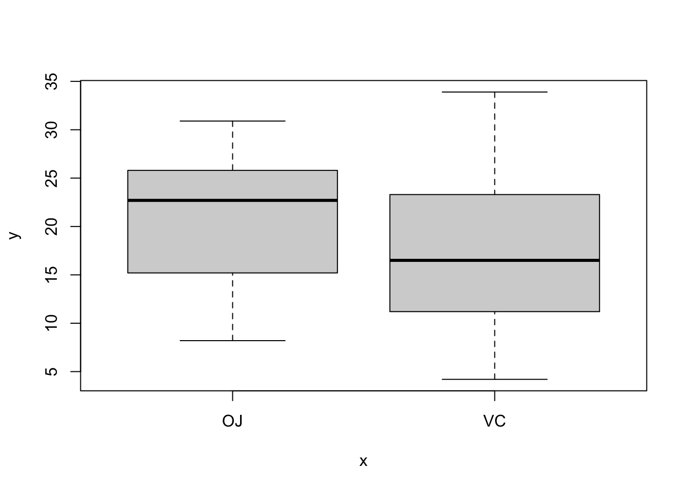
单独介绍一些关于ggplot绘图相关的命令:因为在R中绘图占据很重要的一部分内容。
boxplot对于箱线图,若对于变量x为因子,会自动的创建箱线图。
plot(ToothGrowth$supp, ToothGrowth$len)
进一步想要去探究不同变量之间的关系:这里使用的形式和lm()函数中类似。
boxplot(len~supp+dose, data = ToothGrowth)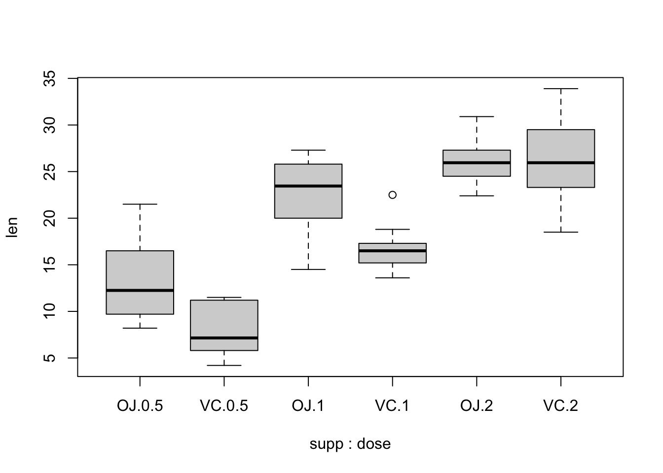
ggplotlibrary(ggplot2)
ggplot(ToothGrowth, aes(x = supp, y = len)) +
geom_boxplot()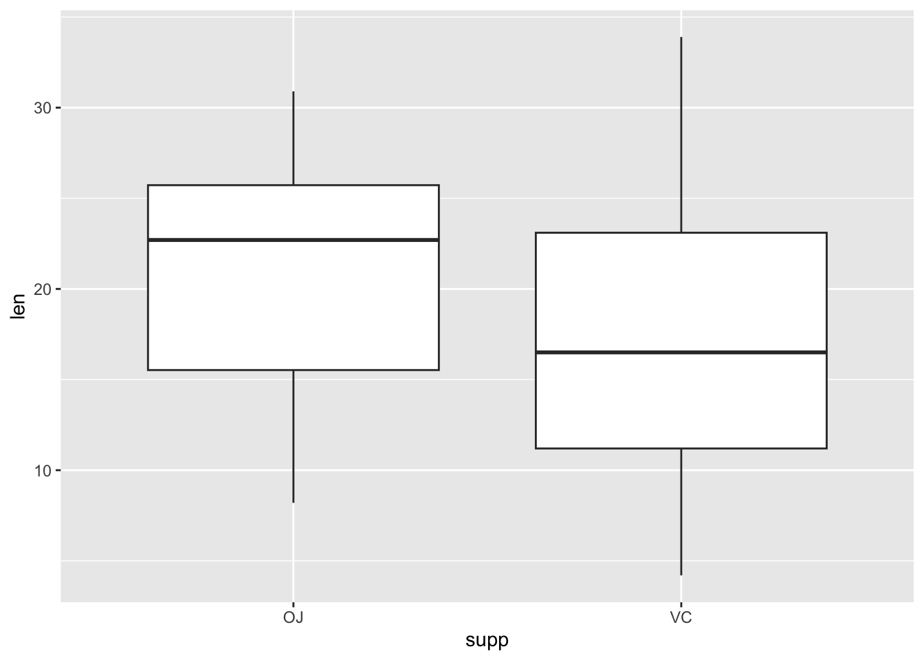
ggplot(ToothGrowth, aes(x = interaction(supp, dose), y = len)) +
  geom_boxplot()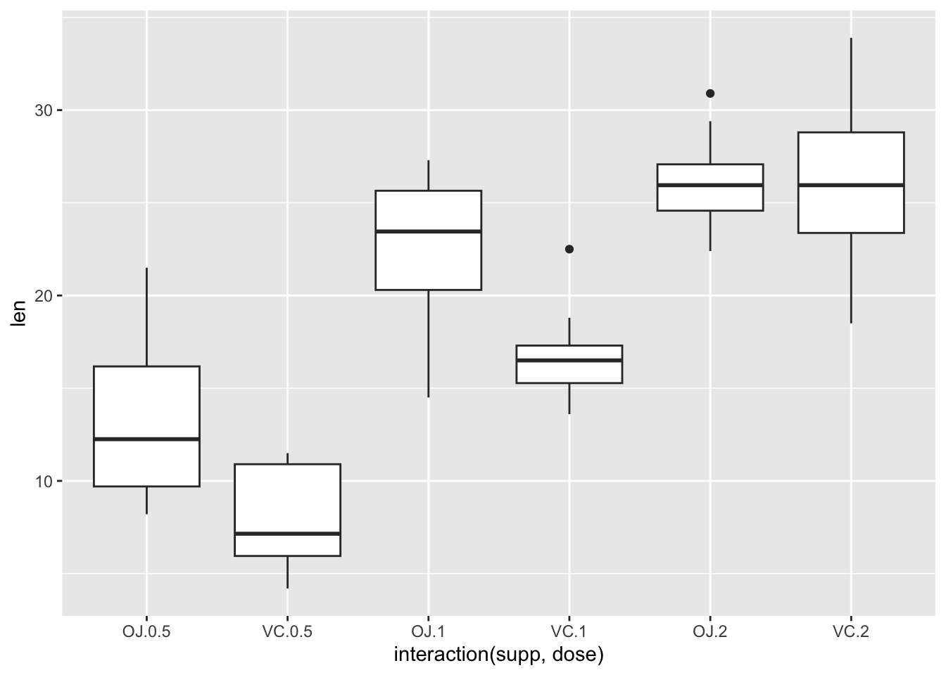
其中的interaction()表示的是x变量之间的交互关系共同构成x变量。
curve(x^3 + x^2 - 5*x, from = -5, to = 5)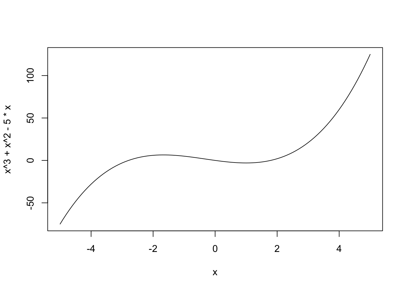
一些比较复杂的做法是通过划分数据点进一步通过geom_line实现。
fx<-function(x)
{
  y<-0.5*log((1-x)/x)
  d<-data.frame(x=x,y=y)
  return(d)
}
x<-seq(0.005,0.5,0.005)
d<-fx(x)
ggplot(d,aes(x,y))+geom_line(color="red")+xlab("x")+ylab("y=0.5*log((1-x)/x)")+theme_bw()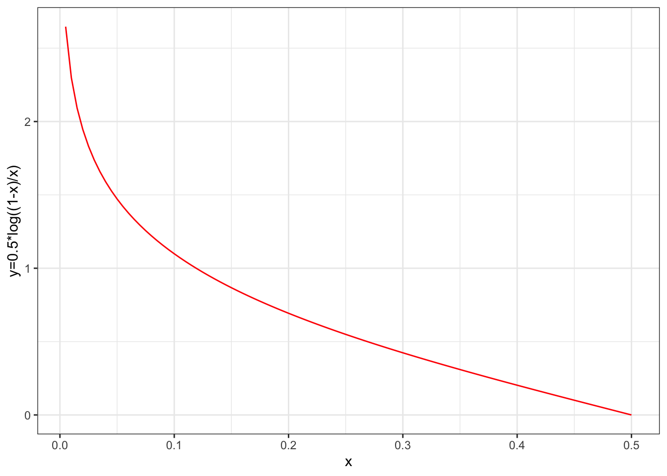
在ggplot中也包含这样的一个函数ggfun()专用于绘制曲线函数图像。
myfun <- function(x) {
  0.5*log((1-x)/x)
}
ggplot(data.frame(x = c(0, 0.5)), aes(x = x)) +
  stat_function(fun = myfun, geom = "line",color="red")+theme_bw()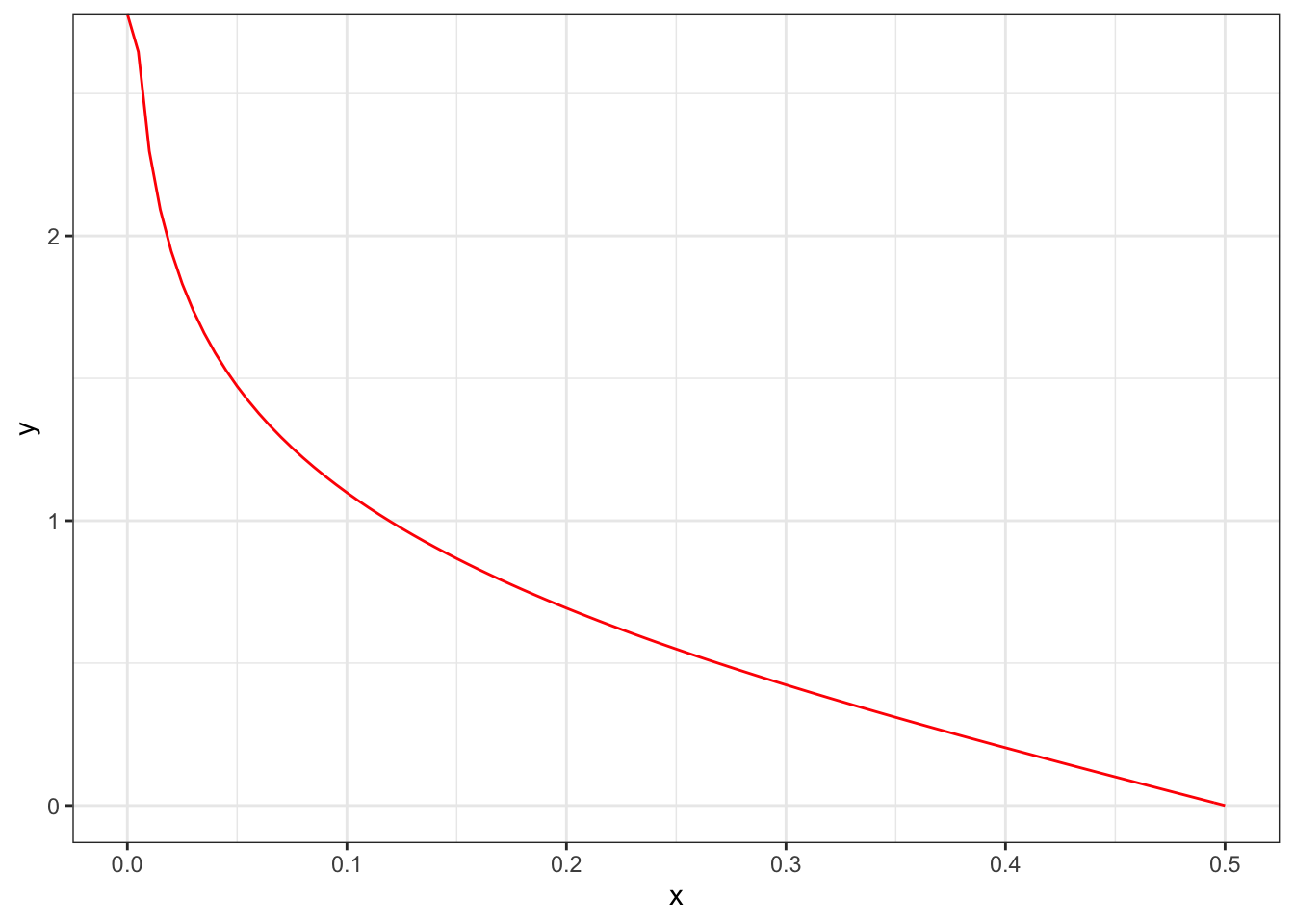
柱状图所对应的数据是当有一列X是每个柱的位置,而Y表示的是对应柱子的高度。
BOD Time demand
1 1 8.3
2 2 10.3
3 3 19.0
4 4 16.0
5 5 15.6
6 7 19.8ggplot(BOD, aes(x = Time, y = demand)) +
geom_col()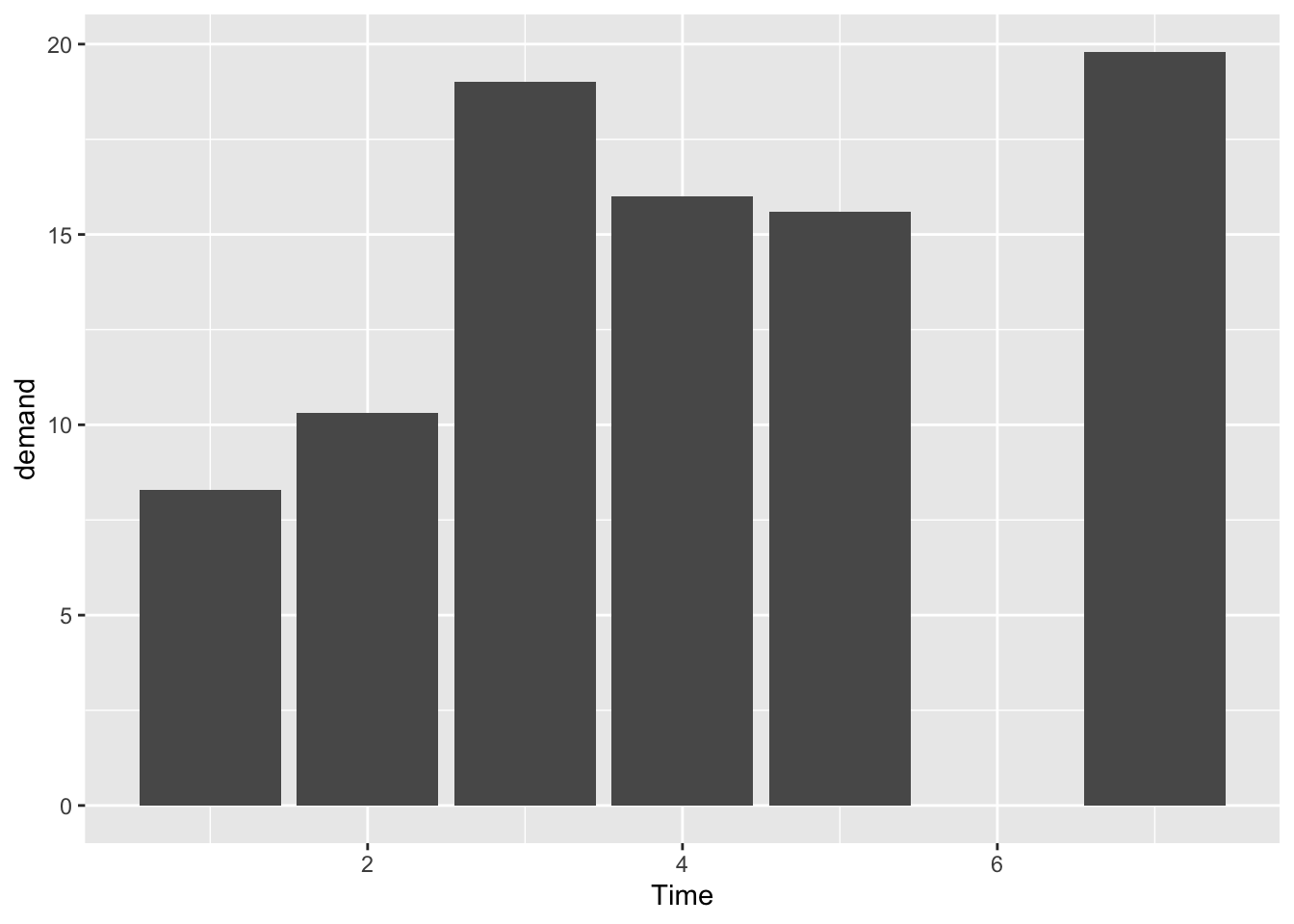
ggplot(BOD, aes(x = factor(Time), y = demand)) +
  geom_col()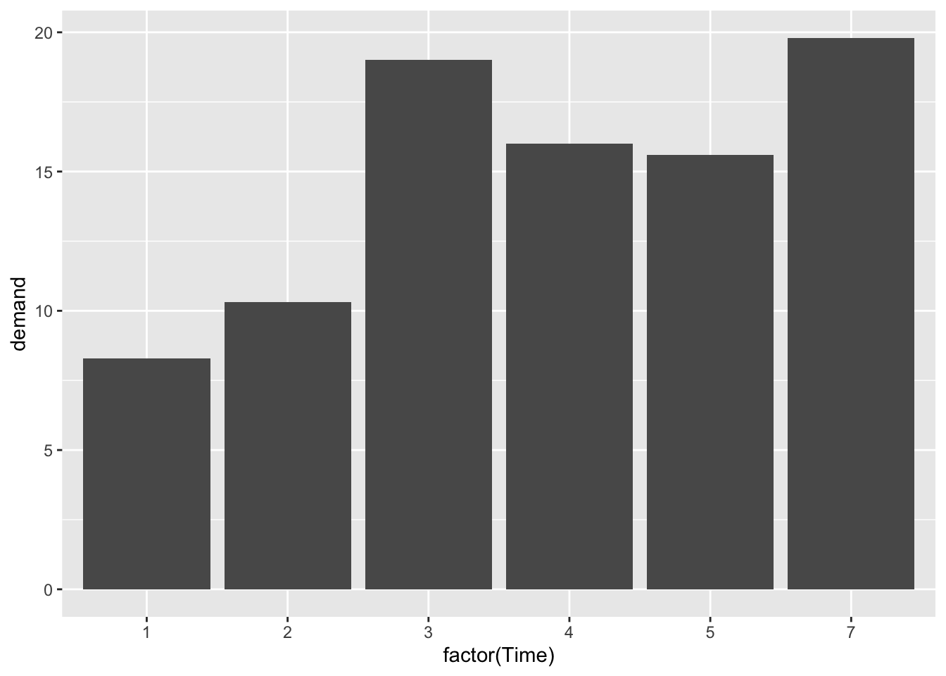
ggplot(BOD, aes(x = Time, y = demand)) +
  geom_line() +
  ylim(0, max(BOD$demand))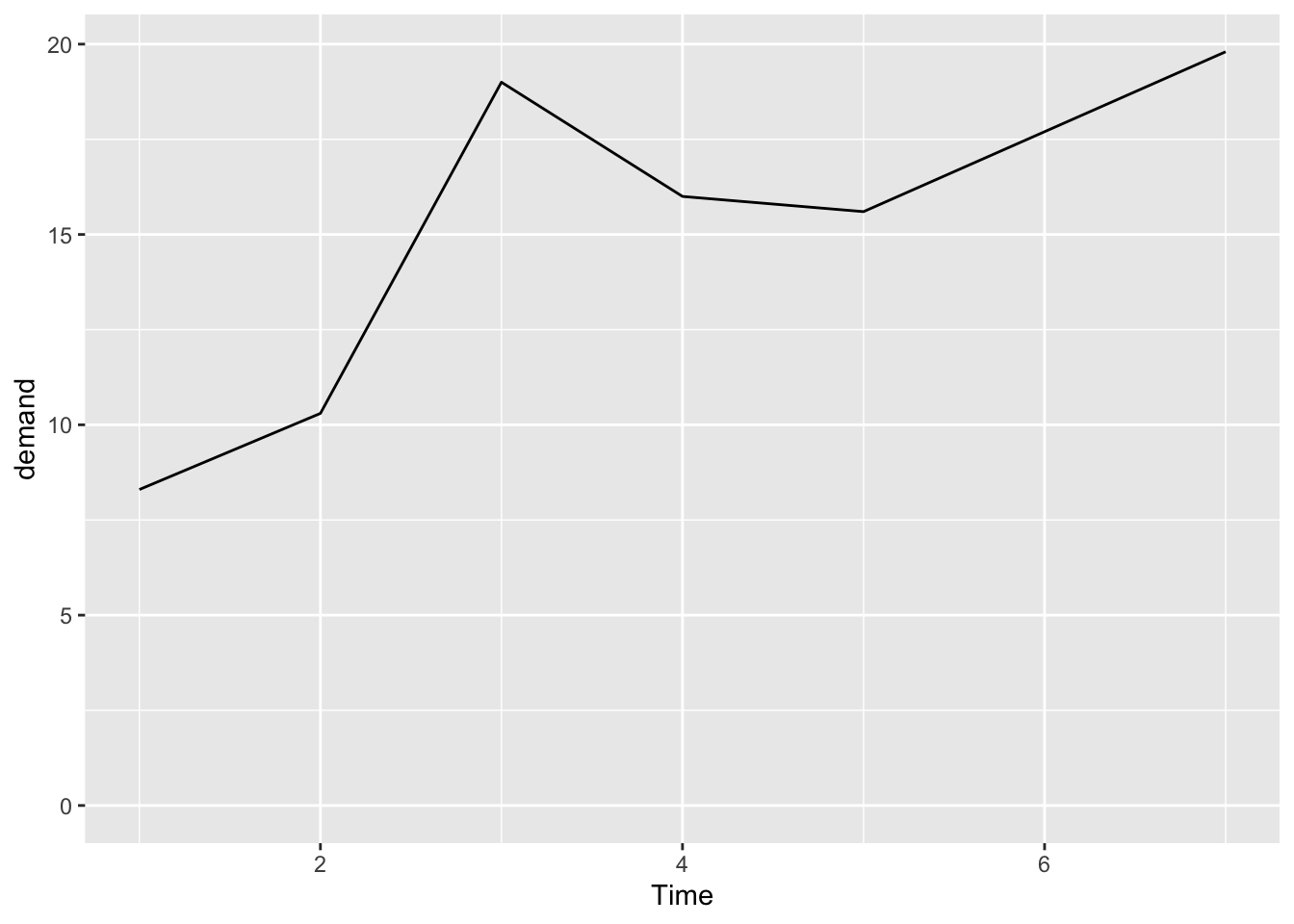
ggplot(BOD, aes(x = Time, y = demand)) +
  geom_line() +
  expand_limits(y = 0)
ggplot(BOD, aes(x = Time, y = demand)) +
  geom_line() +
  geom_point()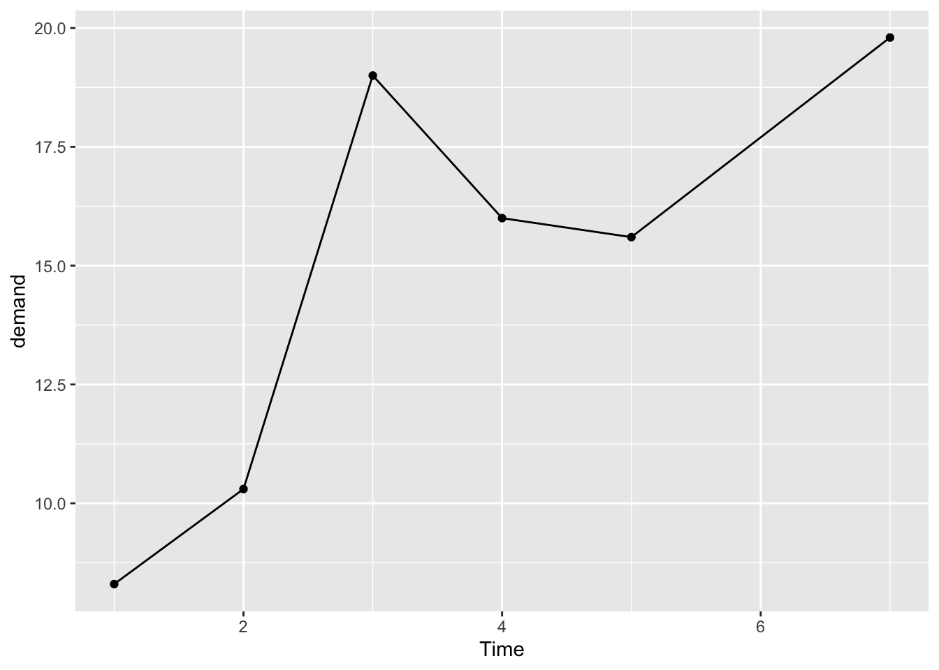
但一些时候,我们需要对数据点的集中性进行描述,若缺乏这部分的描述我们并不能观测到相关的数据形态。
library(gcookbook) # Load gcookbook for the worldpop data set
library(patchwork)
data(worldpop)
ggplot(worldpop, aes(x = Year, y = Population)) +
geom_line() 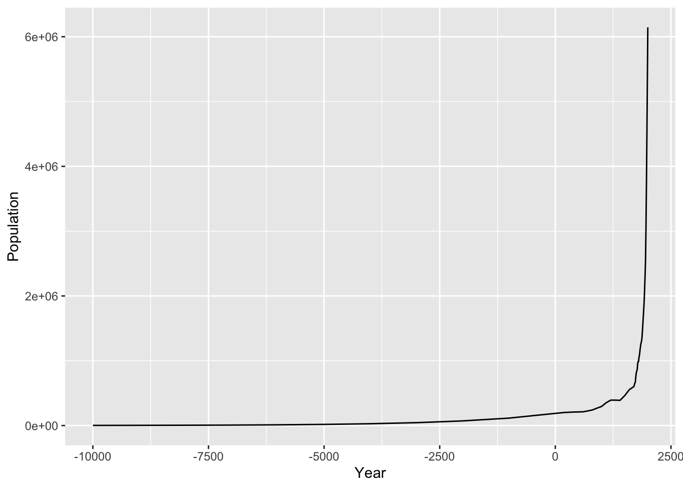
ggplot(worldpop, aes(x = Year, y = Population)) +
  geom_line() +
  geom_point()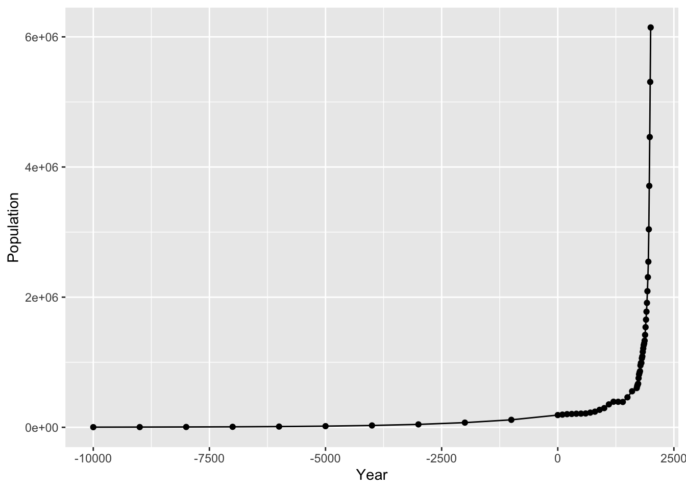
似乎数据都是在0以后较为密集,同时上升的趋势近似于指数形态,可以考虑取对数来观测。
# Same with a log y-axis
ggplot(worldpop, aes(x = Year, y = Population)) +
  geom_line() +
  geom_point() +
  scale_y_log10()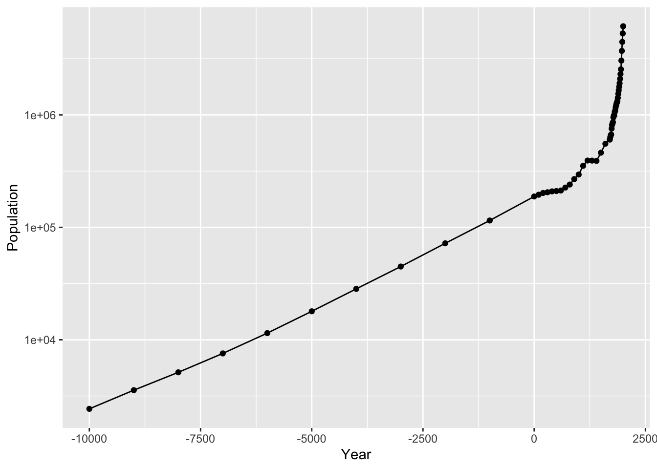
library(gcookbook) # Load gcookbook for the tg data set
data(tg)
# Map supp to colour
ggplot(tg, aes(x = dose, y = length, colour = supp)) +
  geom_line()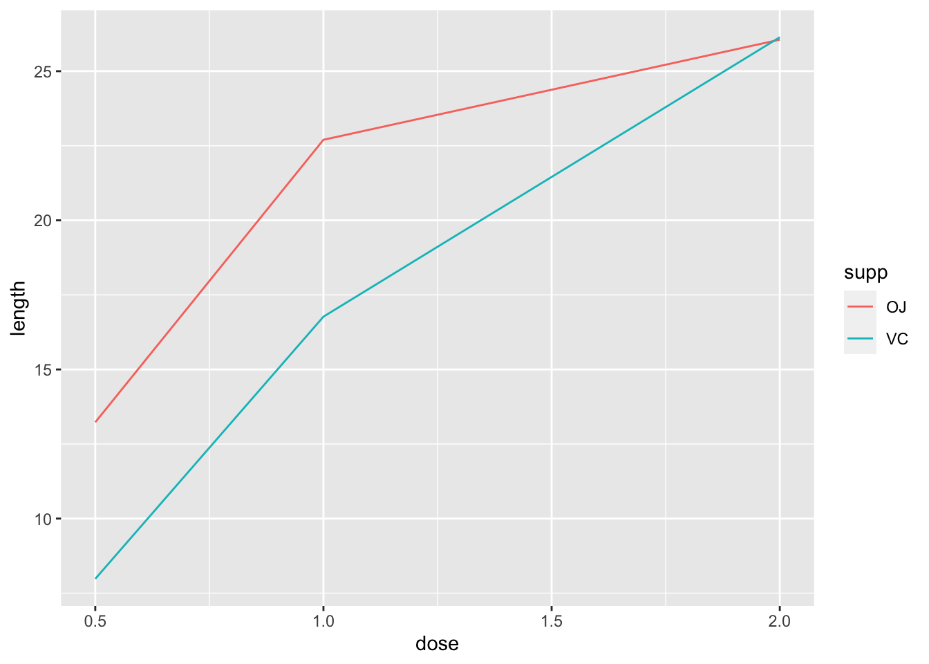
将supp映射到linetype上。
# Map supp to linetype
ggplot(tg, aes(x = dose, y = length, linetype = supp)) +
  geom_line()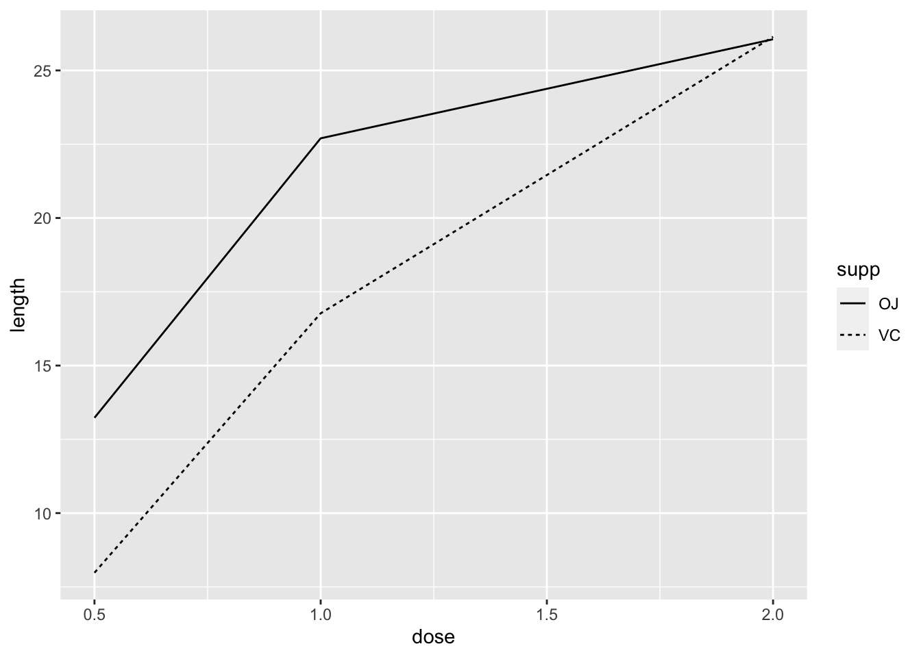
ggplot(tg, aes(x = dose, y = length)) +
  geom_line()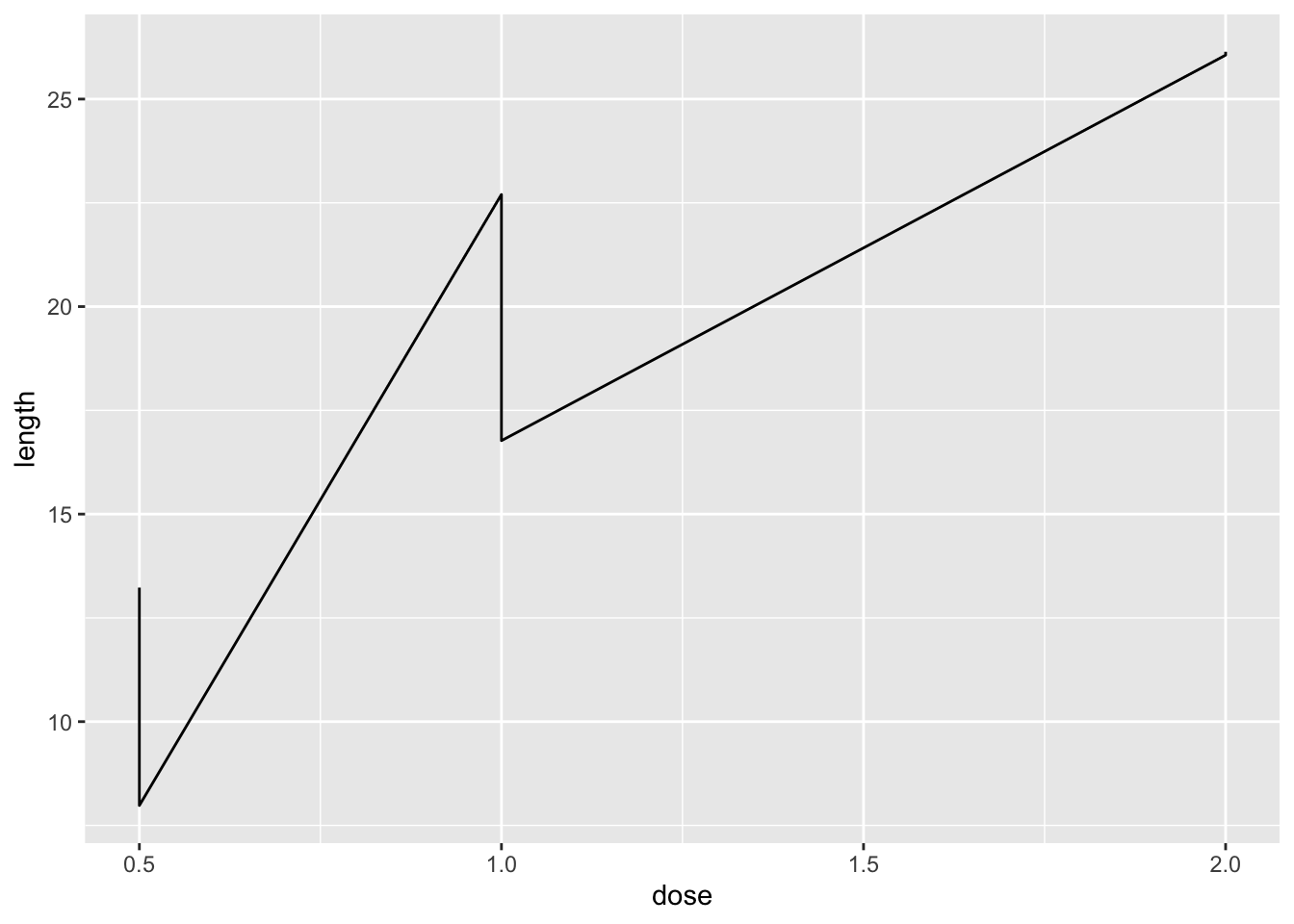
通过观测数据:
tg supp dose length
1 OJ 0.5 13.23
2 OJ 1.0 22.70
3 OJ 2.0 26.06
4 VC 0.5 7.98
5 VC 1.0 16.77
6 VC 2.0 26.14增加了linetype也就是根据supp的数据类生成了两个数据框,再这个两个数据框分别绘制line。
ggplot(tg, aes(x = dose, y = length, shape = supp)) +
  geom_line(position = position_dodge(0.2)) +           # Dodge lines by 0.2
  geom_point(position = position_dodge(0.2), size = 4)  # Dodge points by 0.2
# Convert the sunspot.year data set into a data frame for this example
sunspotyear <- data.frame(
    Year     = as.numeric(time(sunspot.year)),
    Sunspots = as.numeric(sunspot.year)
  )

ggplot(sunspotyear, aes(x = Year, y = Sunspots)) +
  geom_area()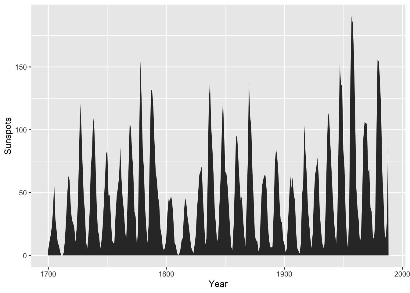
绘制一个面积绘图和曲线结合的方式:先建立一个函数,将定义域设置为[left,right]内,(exclude)y[x<left|x>right]<-NA。
dnorm_limit <- function(x) {
    y <- dnorm(x)
    y[x < 0  |  x > 2] <- NA
    return(y)
}

# ggplot() with dummy data
p <- ggplot(data.frame(x = c(-3, 3)), aes(x = x))

p +
  stat_function(fun = dnorm_limit, geom = "area", fill = "blue", alpha = 0.2) +
  stat_function(fun = dnorm)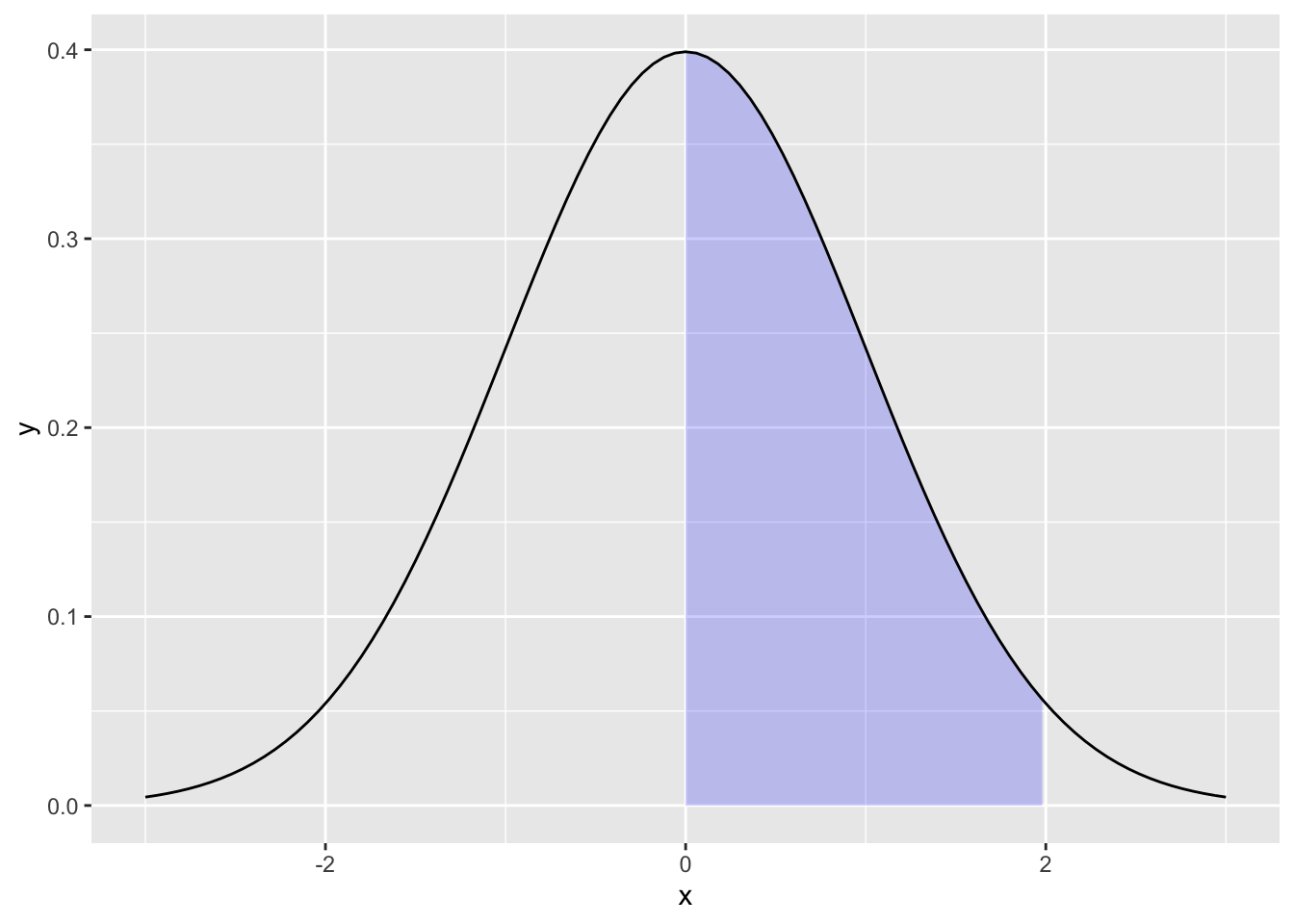
散点图通常用于反映两个连续变量之间的关系,我们进一步可以去使用拟合直线来表示这两个变量之间的关系。
library(gcookbook) # Load gcookbook for the heightweight data set
library(dplyr)
Attaching package: 'dplyr'The following objects are masked from 'package:stats':
filter, lagThe following objects are masked from 'package:base':
intersect, setdiff, setequal, uniondata("heightweight")ggplot(heightweight, aes(x = ageYear, y = heightIn)) +
geom_point()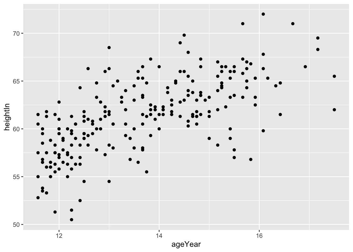
ggplot(heightweight, aes(x = ageYear, y = heightIn)) +
geom_point(shape = 10)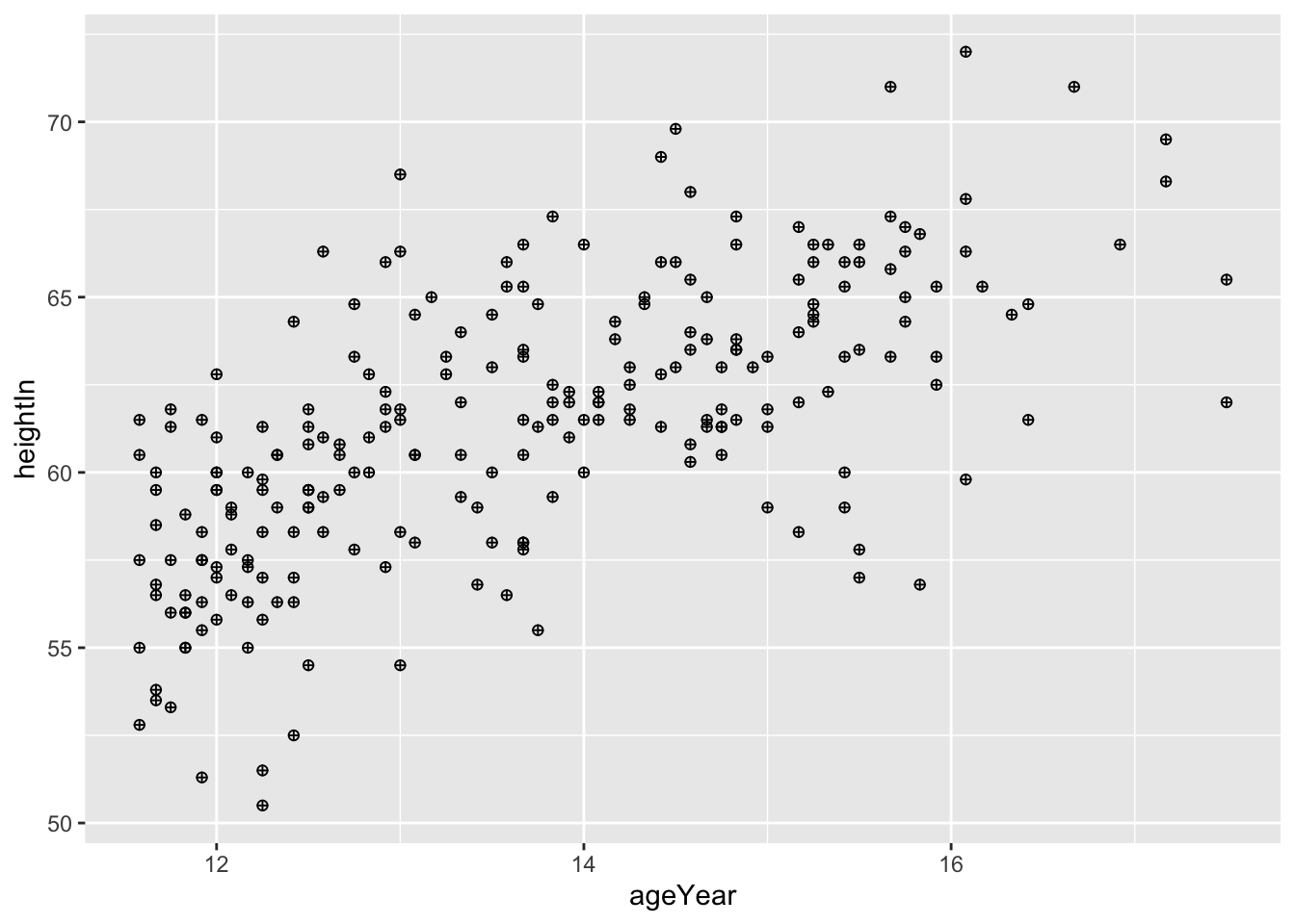
参数shape是对于散点图内的形状进行调整;而size是对散点大小进行调整。
ggplot(heightweight, aes(x = ageYear, y = heightIn)) +
geom_point(size = 1.5)
hw <- heightweight %>%
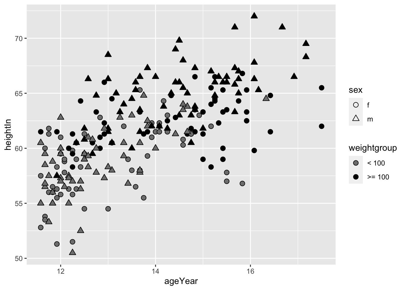
mutate(weightgroup = ifelse(weightLb < 100, "< 100", ">= 100"))
# Specify shapes with fill and color, and specify fill colors that includes an empty (NA) color
ggplot(hw, aes(x = ageYear, y = heightIn, shape = sex, fill = weightgroup)) +
geom_point(size = 2.5) +
scale_shape_manual(values = c(21, 24)) +
scale_fill_manual(
values = c(NA, "black"),
guide = guide_legend(override.aes = list(shape = 21))
)
ggplot(heightweight, aes(x =ageYear,y = heightIn))+
geom_point(aes(color = sex))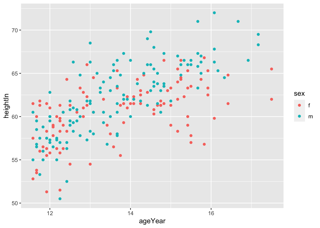
ggplot(heightweight, aes(x = ageYear, y = heightIn)) +
geom_point(aes(shape = sex, colour = sex)) +
scale_shape_manual(values = c(1,2)) +
scale_colour_brewer(palette = "Set1")
ggplot(heightweight, aes(x = ageYear, y = heightIn, colour = weightLb)) +
geom_point()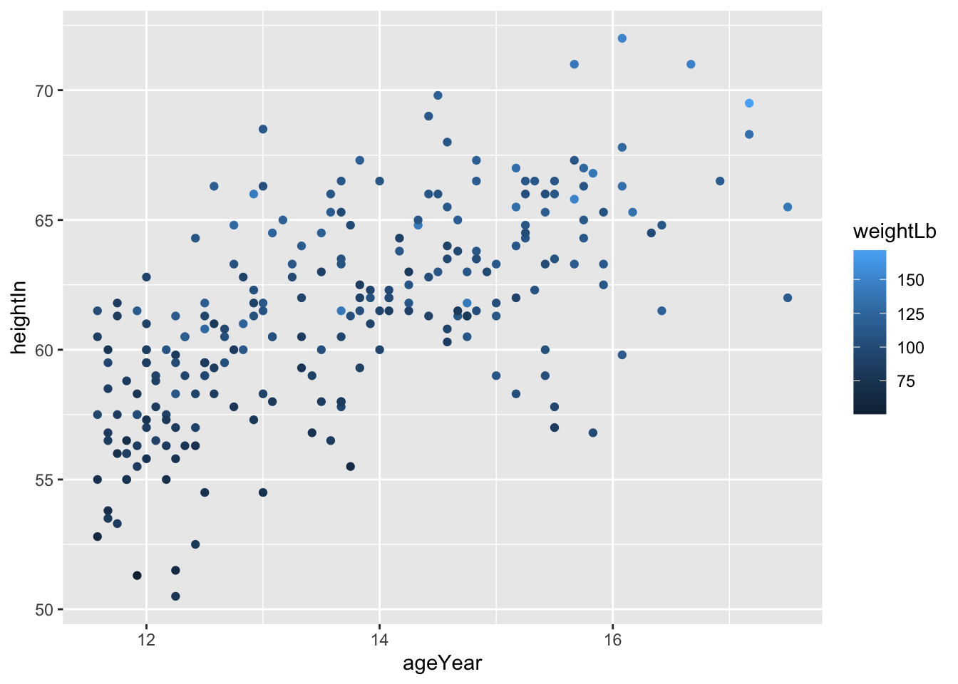
ggplot(heightweight, aes(x = ageYear, y = heightIn, size = weightLb)) +
geom_point()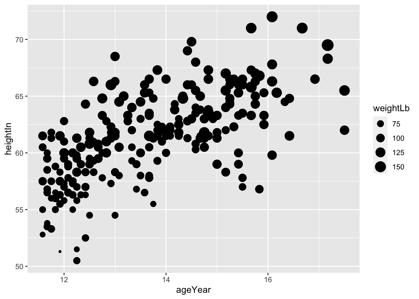
显然从图像中看出年龄和身高是正相关的。
ggplot(heightweight, aes(x = ageYear, y = heightIn)) +
geom_point()+
stat_smooth(method = lm, se = FALSE, colour = "red")`geom_smooth()` using formula = 'y ~ x'
ggplot(heightweight, aes(x = ageYear, y = heightIn)) +
  geom_point()+
  stat_smooth(method = lm, se = TRUE, colour = "red")
`geom_smooth()` using formula = 'y ~ x'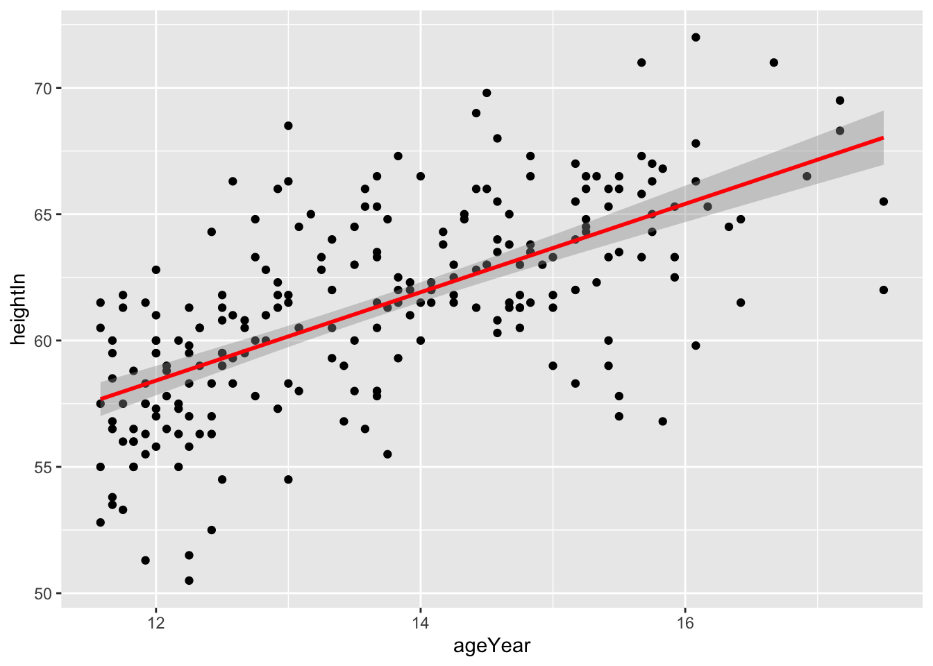
ggplot(heightweight, aes(x = ageYear, y = heightIn)) +
  geom_point(color="gray")+
  stat_smooth(method = loess, se = T, colour = "blue")
`geom_smooth()` using formula = 'y ~ x'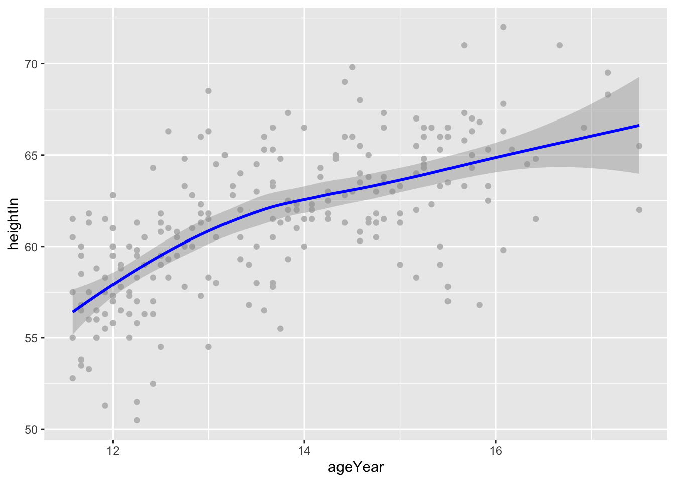
ggplot(heightweight, aes(x = ageYear, y = heightIn, color = sex)) +
  geom_point()+
  geom_smooth(method = lm, se = TRUE, fullrange = TRUE)
`geom_smooth()` using formula = 'y ~ x'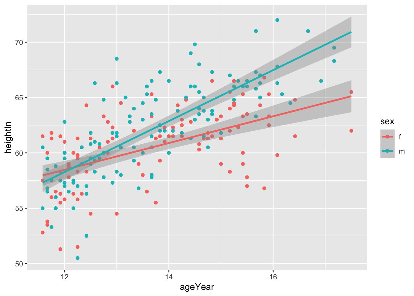
ggplot(heightweight, aes(x = ageYear, y = heightIn, color = sex)) +
  geom_point()+
  geom_smooth(method = loess, se = TRUE, fullrange = TRUE)
`geom_smooth()` using formula = 'y ~ x'Warning: Removed 5 rows containing missing values (`geom_smooth()`).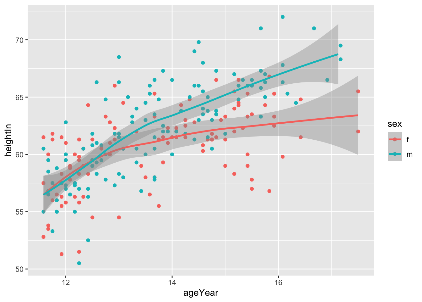
还有诸如glm等拟合方法:
library(MASS)
Attaching package: 'MASS'The following object is masked from 'package:dplyr':
selectThe following object is masked from 'package:patchwork':
areabiopsy_mod <- biopsy %>%
mutate(classn = recode(class, benign = 0, malignant = 1))
ggplot(biopsy_mod, aes(x = V1, y = classn)) +
geom_point(
position = position_jitter(width = 0.3, height = 0.06),
alpha = 0.4,
shape = 21,
size = 1.5
) +
stat_smooth(method = glm, method.args = list(family = binomial))`geom_smooth()` using formula = 'y ~ x'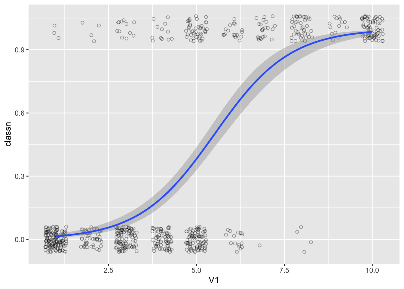
ggplot(heightweight, aes(x = ageYear, y = heightIn)) +
  geom_point()+
  geom_smooth(method = "lm")+
  annotate("text",x = 16.5,y = 53,label = "r^2==0.42",parse=T)
`geom_smooth()` using formula = 'y ~ x'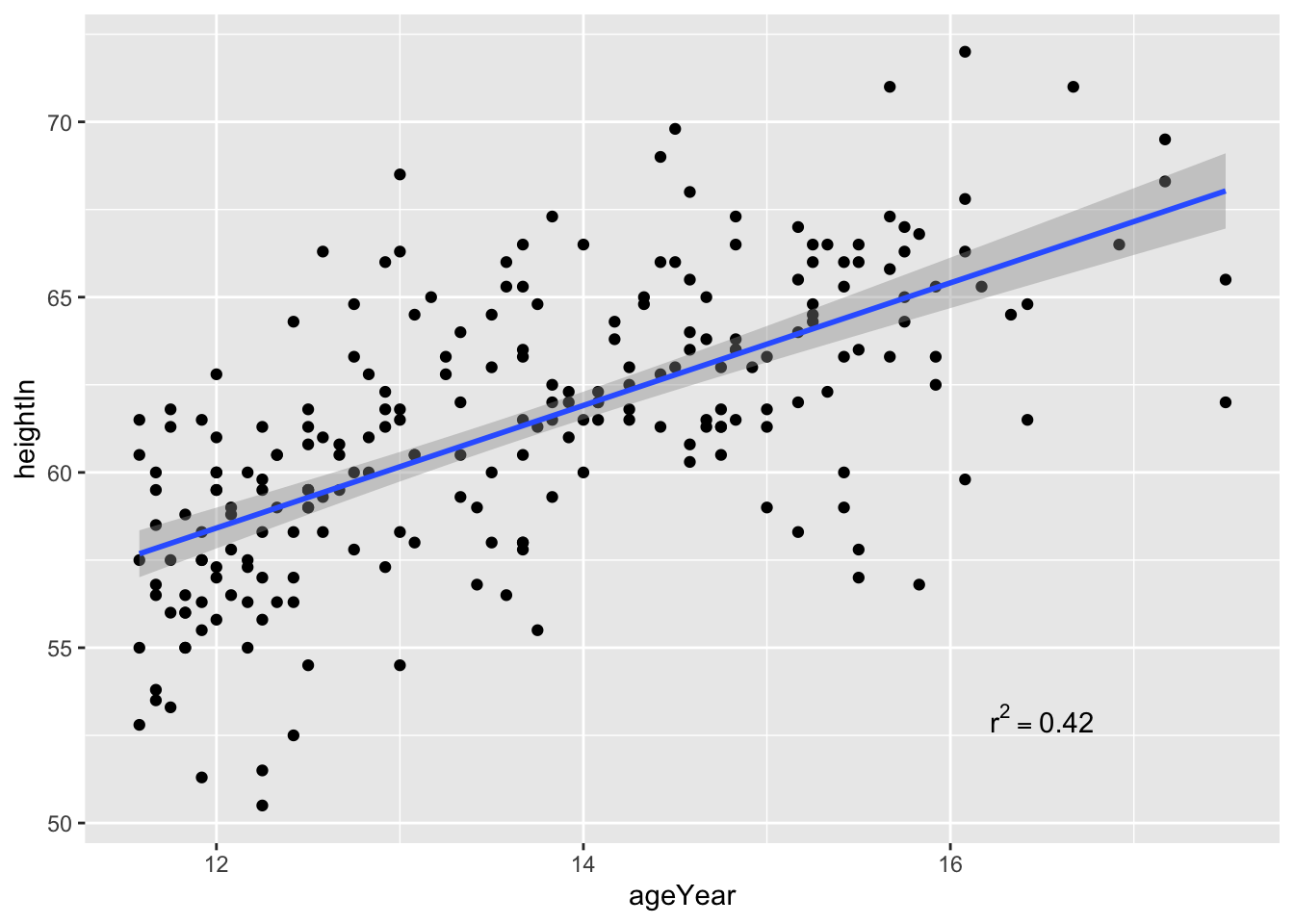
其中的参数parse可以使得表达式以数学公式表示。
ggplot(faithful, aes(x = eruptions, y = waiting)) +
  geom_point() +
  geom_rug()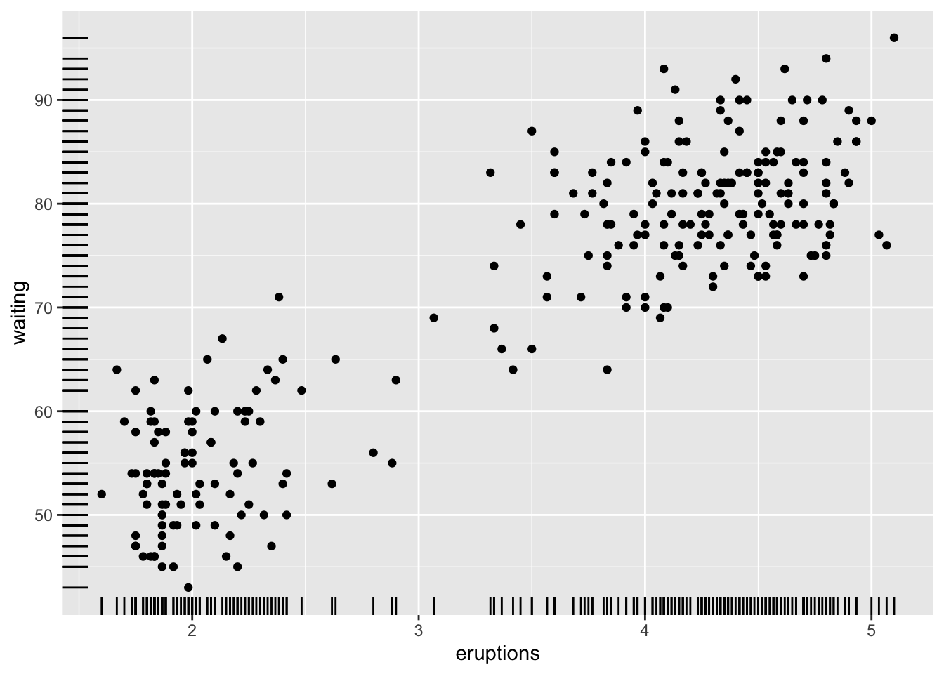
geom_rug()可以在坐标轴上表明散点出现的频率。
美学映射是图形语法中重要的一个概念,变量映射到元素上,通过几何形状GEOM画出图形。
学习使用STAT的原因可以归结如此:
“Even though the data is tidy, it may not represent the values you want to display”
simple_data <- tibble(group = factor(rep(c("A", "B"), each = 15)),
                      subject = 1:30,
                      score = c(rnorm(15, 40, 20), rnorm(15, 60, 10)))
simple_data
# A tibble: 30 × 3
group subject score
<fct> <int> <dbl>
1 A 1 31.3
2 A 2 36.5
3 A 3 20.6
4 A 4 25.8
5 A 5 64.9
6 A 6 46.2
7 A 7 22.5
8 A 8 21.3
9 A 9 35.5
10 A 10 49.3
# … with 20 more rows假定我们想要画出一个柱状图,一个柱子代表每一组的group,柱子高度代表均值。显然直接使用GEOM是没有对应的绘图函数实现,首先需要对原始数据进行操作才可实现。
simple_data %>%
  group_by(group)%>%
  summarize(
    mean_score = mean(score),
    .groups = 'drop'
  )%>%
  ggplot(aes(x = group, y = mean_score))+
  geom_col()
其中传递给ggplot()的
simple_data %>%
  group_by(group) %>%
  summarize(
    mean_score = mean(score),
    .groups = 'drop'
  )
# A tibble: 2 × 2
group mean_score
<fct> <dbl>
1 A 34.6
2 B 60.4再将数据变形获得误差棒
simple_data %>%
  group_by(group) %>%
  summarize(
    mean_score = mean(score),
    se = sqrt(var(score)/length(score)),
    .groups = 'drop'
  ) %>%
  mutate(
    lower = mean_score - se,
    upper = mean_score + se
  )
# A tibble: 2 × 5
group mean_score se lower upper
<fct> <dbl> <dbl> <dbl> <dbl>
1 A 34.6 4.11 30.4 38.7
2 B 60.4 2.09 58.3 62.5传递到ggplot:
simple_data %>%
  group_by(group) %>%
  summarize(
    mean_score = mean(score),
    se = sqrt(var(score)/length(score)),
    .groups = 'drop'
  ) %>%
  mutate(
    lower = mean_score - se,
    upper = mean_score + se
  )%>%
  ggplot(aes(x= group,y = mean_score,ymin = lower, ymax = upper))+
  geom_errorbar()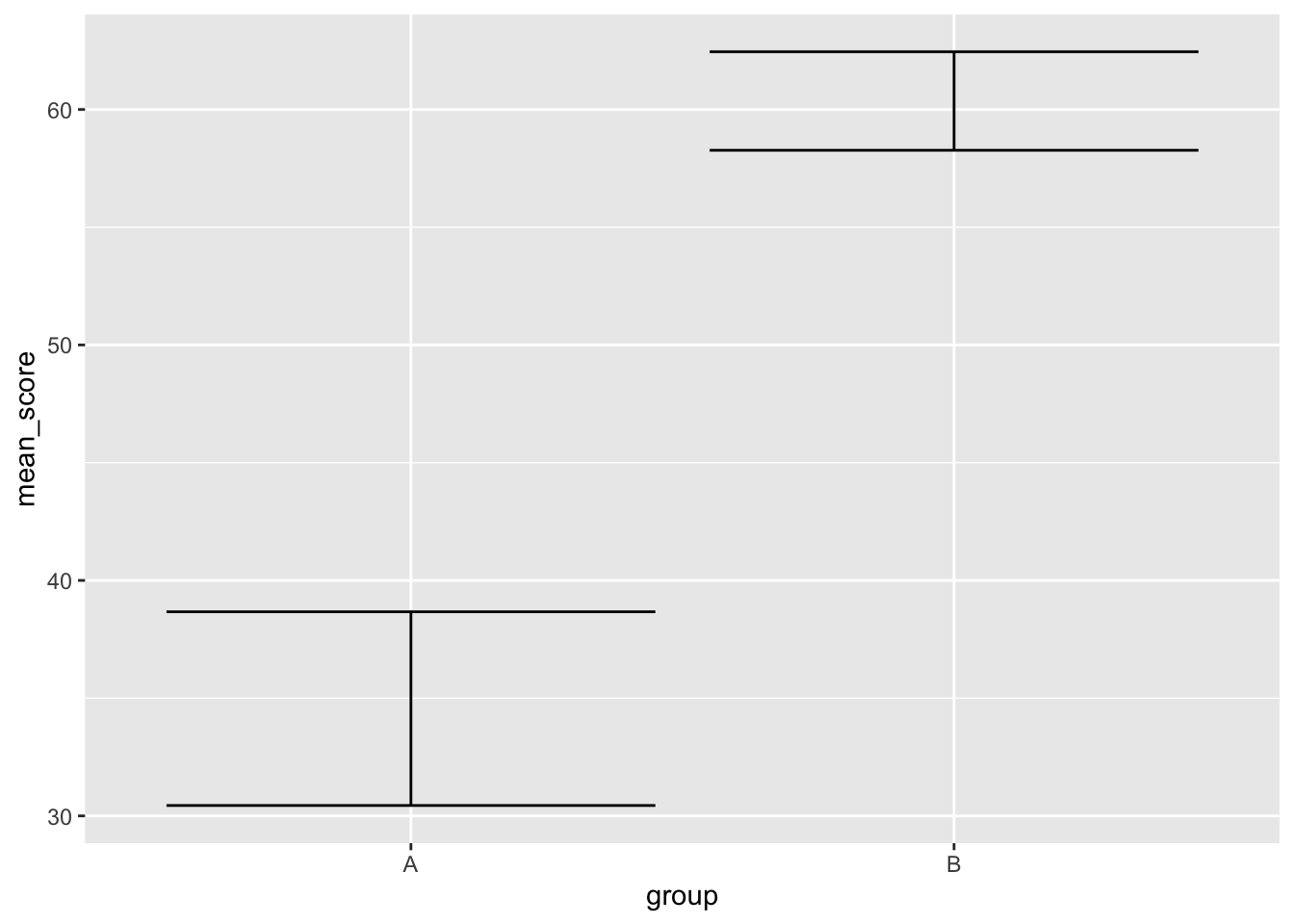
再进行组合先前的数据:
simple_data %>%
  group_by(group) %>%
  summarize(
    mean_score = mean(score),
    se = sqrt(var(score)/length(score)),
    .groups = 'drop'
  ) %>%
  mutate(
    lower = mean_score - se,
    upper = mean_score + se
  )%>%
  ggplot() +
  geom_col(
    aes(x = group, y = mean_score),
  ) +
  geom_errorbar(
    aes(x = group, y = mean_score, ymin = lower, ymax = upper),
  )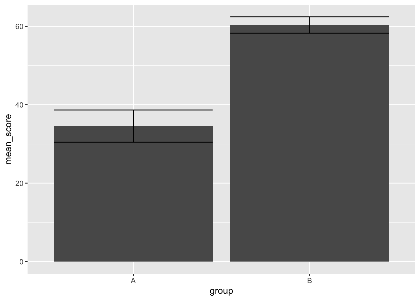
再完成这样的一个图形之后,我们会发现其完成的步骤是较为繁琐的:
simple_data %>%
  ggplot(aes(group, score)) +
  stat_summary(geom = "bar") +
  stat_summary(geom = "errorbar")
No summary function supplied, defaulting to `mean_se()`
No summary function supplied, defaulting to `mean_se()`
stat_summary使用stat_summary是工作中最为常用的方法,为理解它举一个例子:
一个测试数据:
height_df <- tibble(group = "A",
                    height = rnorm(30, 170, 10))
height_df %>%
ggplot(aes(x = group, y = height)) +
geom_point()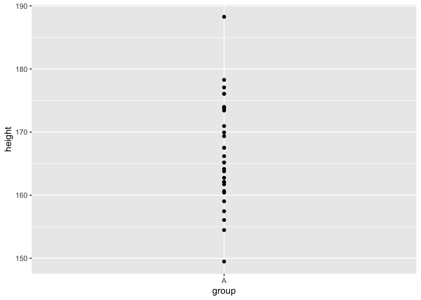
使用stat_summary代替geom_point
height_df %>%
  ggplot(aes(x = group, y = height)) +
  stat_summary()
No summary function supplied, defaulting to `mean_se()`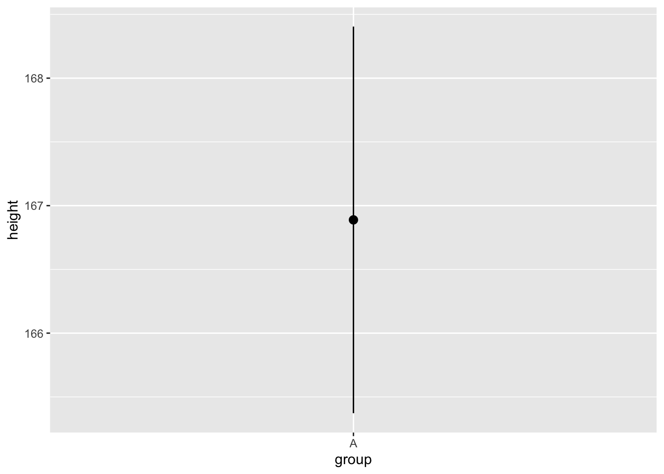
最后会变成一条线和一个点,就像一个点的区间: geom_pointrange
height_df %>%
ggplot(aes(x = group, y = height)) 
height_df %>%
  ggplot(aes(x = group, y = height)) +
  stat_summary(
    geom = "pointrange",
    fun.data = mean_se
  )
stat_summary函数可以进行调取geom_pointrange方法
参数fun.data 会调用函数将数据变形,这个函数默认是mean_se()
fun.data 返回的是数据框,这个数据框将用于geom参数画图,这里缺省的geom是pointrange
如果fun.data 返回的数据框包含了所需要的美学映射,图形就会显示出来。