library(showtext)Loading required package: sysfontsLoading required package: showtextdbshowtext_auto()library(showtext)Loading required package: sysfontsLoading required package: showtextdbshowtext_auto()ts对象时间序列是一组按照时间发生先后顺序进行排列,并且包含一些信息的数据点序列。在R中,这些信息可以被储存在ts对象中。 时间序列在金融领域得到较为广泛的应用。 假设我们有某个变量在过去几年中每年的观测值:
Years |
obs |
|---|---|
2,012 |
123 |
2,013 |
39 |
2,014 |
78 |
2,015 |
52 |
2,016 |
110 |
我们可以使用R中自带的ts()函数,来获取一个时间序列数据。
y <- ts(c(123,39,78,52,110), start=2012)
y
Time Series:
Start = 2012
End = 2016
Frequency = 1
[1] 123 39 78 52 110这里start=设置的是起始时间,在频率大于1下可以增加月份,以c(year,cycle)来表示起始时间。同样我们也可设置截至日期end=来得到一个时间区间。 比如是一个季度的数据,即frequency=4:
y <- ts(c(123,39,78,52,110), start=c(2012,2),frequency = 4)
y
Qtr1 Qtr2 Qtr3 Qtr4
2012 123 39 78
2013 52 110 这里的起始时间就是在2012年的第二季度开始。以下数据为月度的数据:
y <- ts(obs, start=2003, frequency=12)
y
Jan Feb Mar Apr May
2003 123 39 78 52 110在R中常用的频率:
datatype |
frequen |
|---|---|
年度 |
1 |
季度 |
4 |
月度 |
12 |
周 |
52 |
时间序列作图可以用最为常见的plot实现。
plot(y,plot.type = "single",lty=2)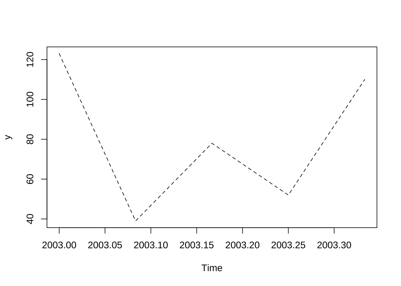
更为高级的用法可以使用fpp2包进行绘图,该包是基于ggplot所实现用于时间序列绘图的包。
library(fpp2)Registered S3 method overwritten by 'quantmod':
method from
as.zoo.data.frame zoo ── Attaching packages ────────────────────────────────────────────── fpp2 2.4 ──✔ ggplot2 3.4.0 ✔ fma 2.4
✔ forecast 8.18 ✔ expsmooth 2.3 autoplot(a10)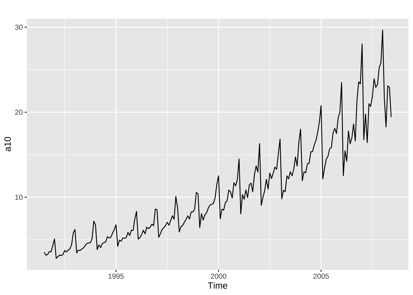
其中的autoplot()包能够绘制你所传递的第一个参数内容。我们就可以对于该数据进行简单的分析:如图中的时间序列在整体上呈现周期性较强的特点,同时趋势上也在增长。进一步可以推断当我们对降糖药物的销量进行预测时,需同时考虑其趋势和季节性因素。
仍然使用原有的数据a10:
showtext::showtext_auto()
ggseasonplot(a10, year.labels=TRUE, year.labels.left=TRUE)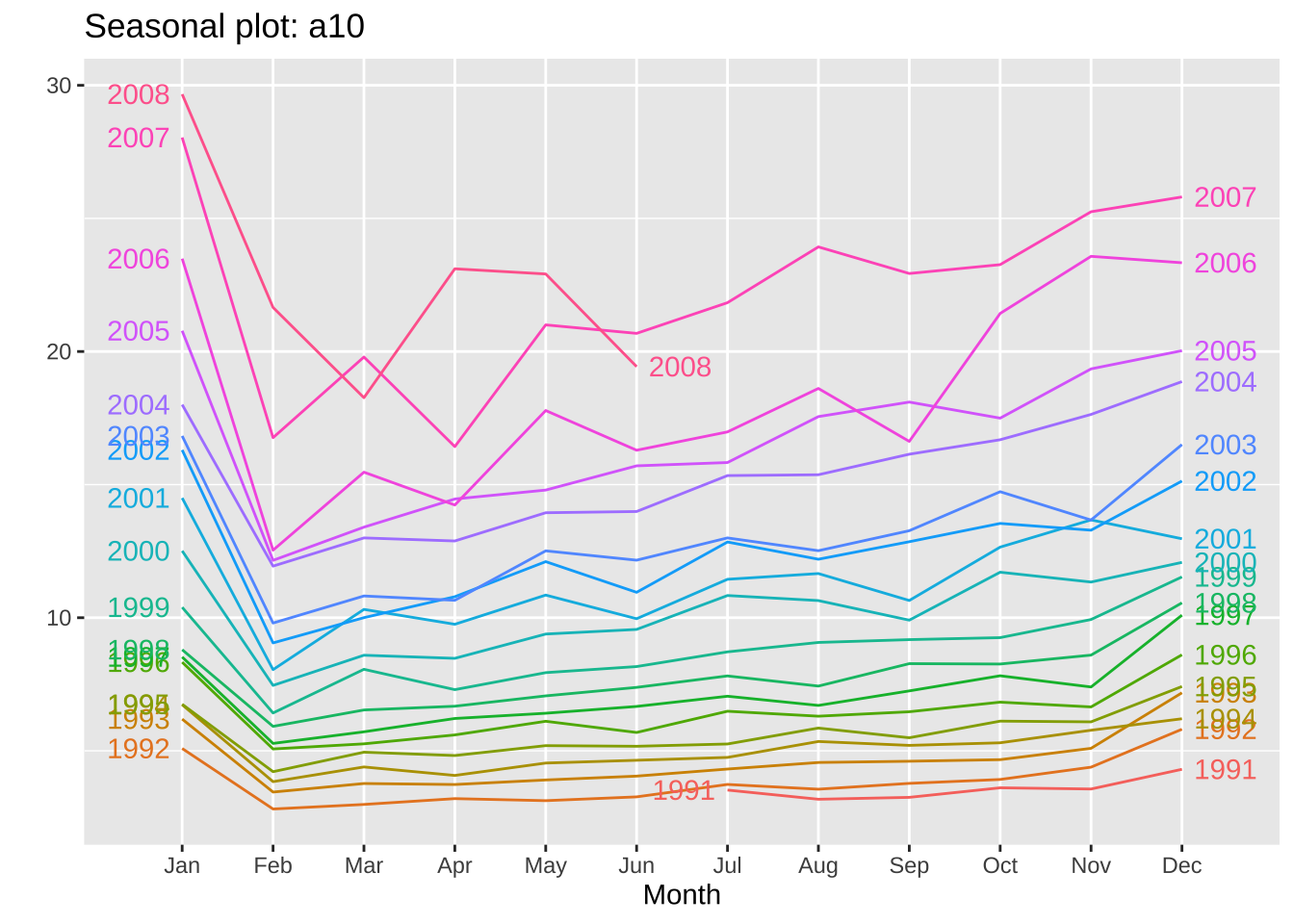
seasonplot(a10)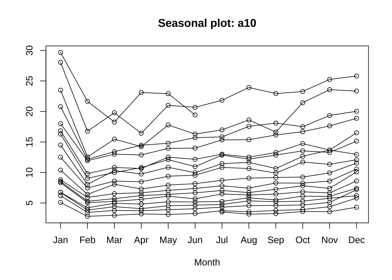
ggseasonplot是在forecast包内的函数,是基于seasonplot得到的ggplot绘图风格的函数。能够将在以年作为周期来进行绘制。
year.labels是将标签在右侧进行显示;year.labels.left将每年的标签在图中的左侧显示,同时也取消了图例的显示。
我们可通过ggsubseriesplot()来着重绘制相同月份的同比变化情况。
library(showtext)
showtext_auto()
ggsubseriesplot(a10) +
  xlab("month")+
  ylab("million(monthly") +
  ggtitle("Subsequence seasonal chart: Sales volume of hypoglycemic drugs")+
  theme(text = element_text(family = "serif"))+
  theme(plot.title = element_text(hjust = 0.5))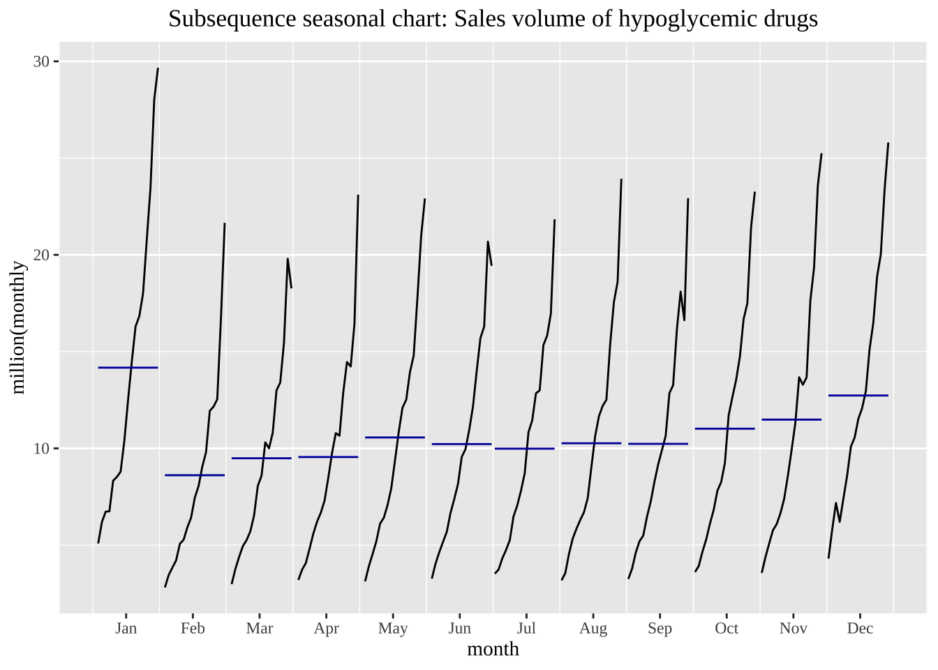
qplot(Temperature, Demand, data=as.data.frame(elecdemand)) +
  ylab("Electricity consumption (gigawatts)") + xlab("T (Celsius degree)")+
  theme(text = element_text(family = "serif"))+
  theme(plot.title = element_text(hjust = 0.5))
Warning: `qplot()` was deprecated in ggplot2 3.4.0.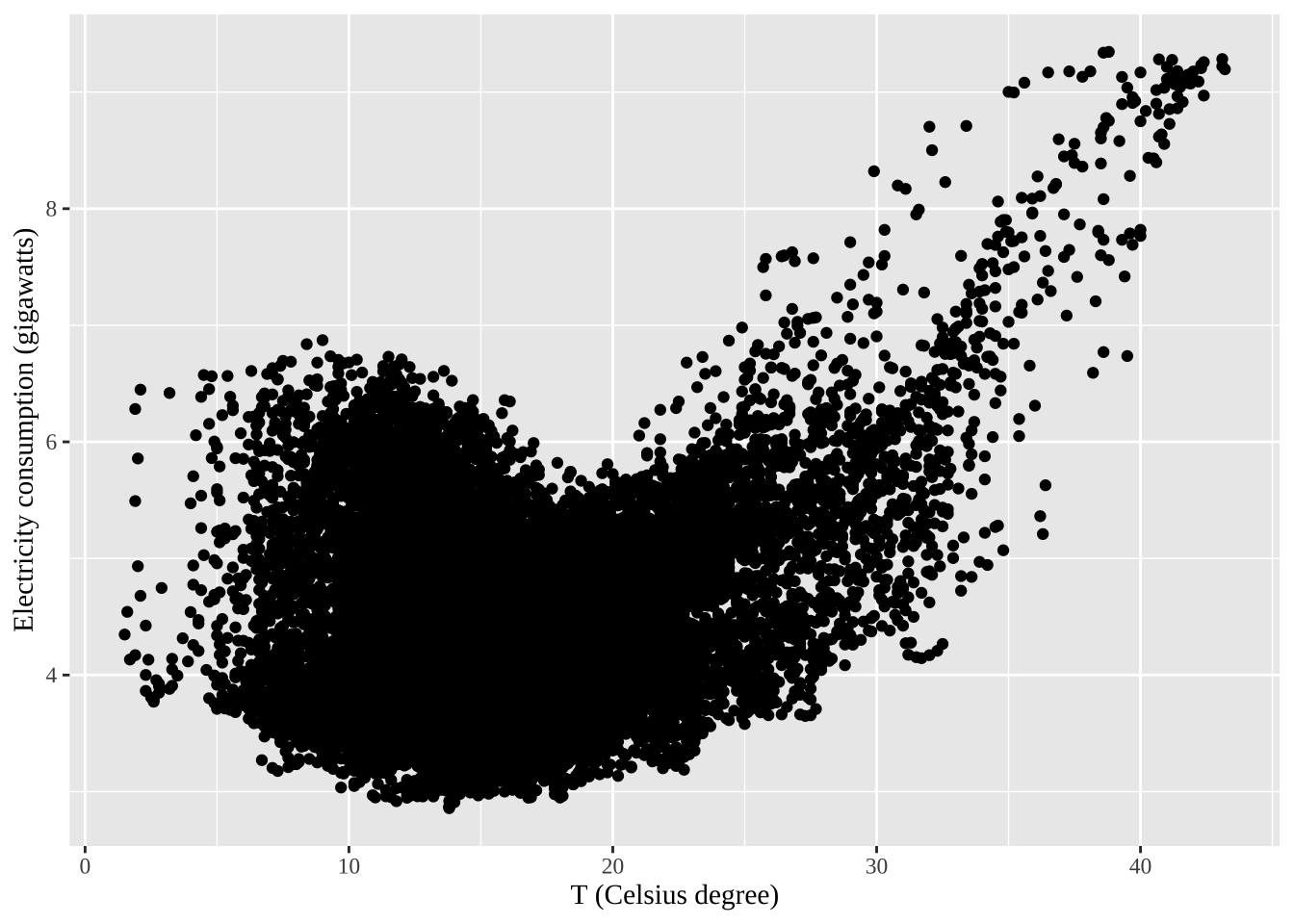
散点图矩阵
autoplot(visnights[,1:5], facets=TRUE) +
  ylab("Number of visitors seasonly(billion)")+
  theme(text = element_text(family = "serif"))+
  theme(plot.title = element_text(hjust = 0.5))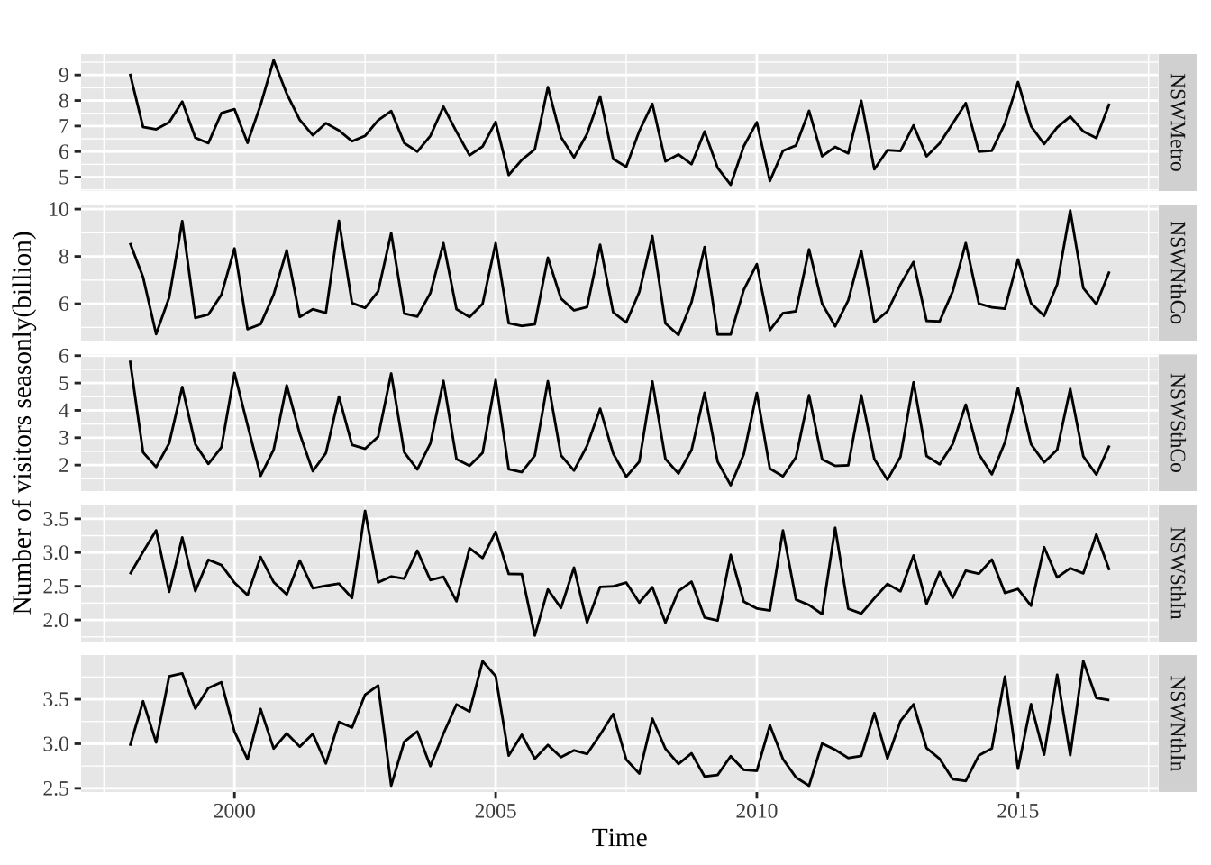
visnights[,1:5] %>% as.data.frame() %>% GGally::ggpairs()Registered S3 method overwritten by 'GGally':
method from
+.gg ggplot2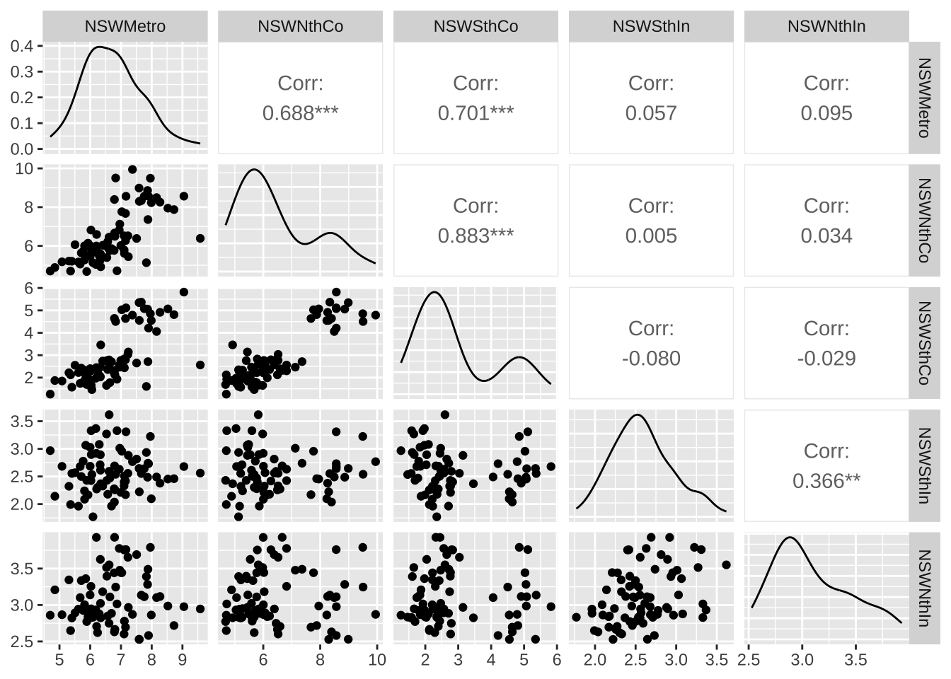
当数据具有趋势性时,短期滞后的自相关值较大,因为观测点附近的值波动不会很大。时间序列的ACF一般是正值,随着滞后阶数的增加而缓慢下降。
aelec <- window(elec, start=1980)
autoplot(aelec) + xlab("Years") + ylab("megawatt") +
  theme(text = element_text(family = "serif")) +
  theme(plot.title = element_text(hjust = 0.5))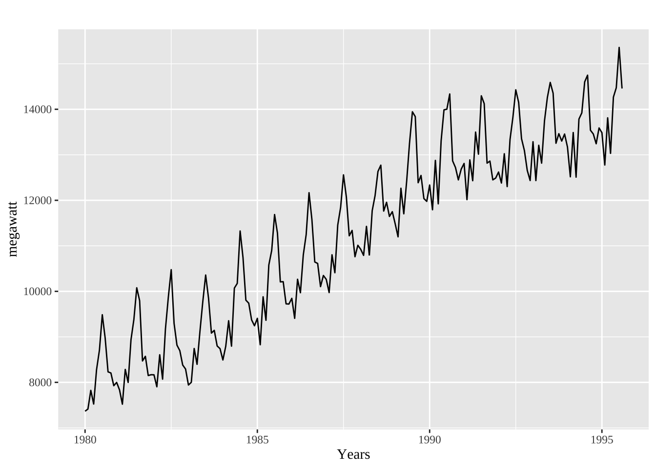
ggAcf(aelec, lag=48) +
  ggtitle('')+
  theme(text = element_text(family = "serif"))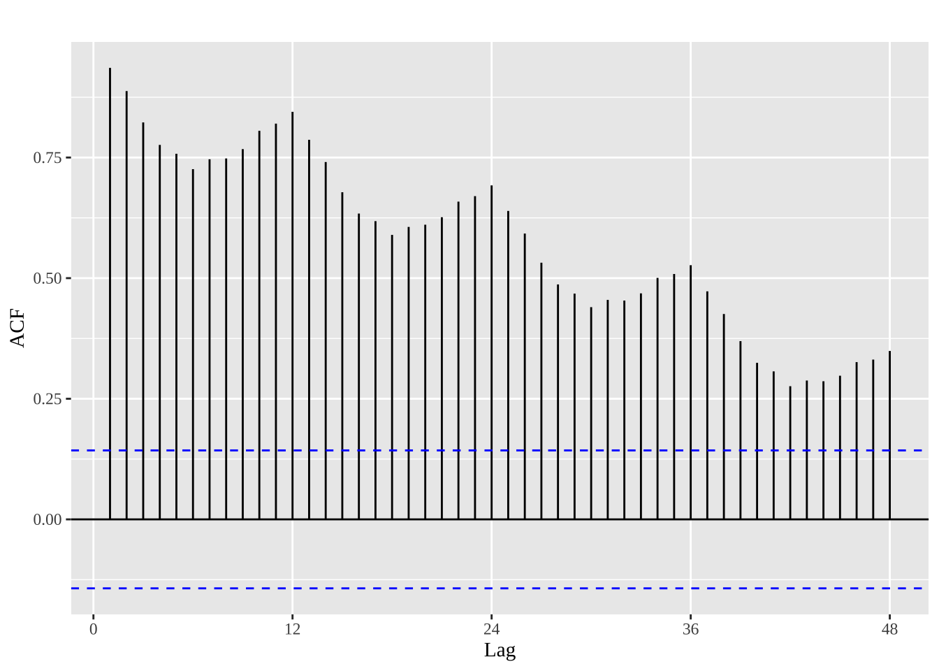
在随机过程中我们知道,白噪声表示的是随机的扰动项,是一个与所有的时间序列相关系数为0的随机过程。
set.seed(30)
y <- ts(rnorm(50))
autoplot(y) + ggtitle("white noise") +
  theme(text = element_text(family = "serif"))+
  theme(plot.title = element_text(hjust = 0.5))
检验一个白噪声,根据其性质,其理想情况下的自相关为0,同时又存在随机扰动,对于一个时间序列为T的白噪声序列,在0.95置信水平下,其自相关值处于\(\pm 2/\sqrt T\)之间,由此可绘制ACF的边界值。若一个序列中较多的值位于边界之外,该序列就不太可能为白噪声。
ggAcf(y) +
  ggtitle('')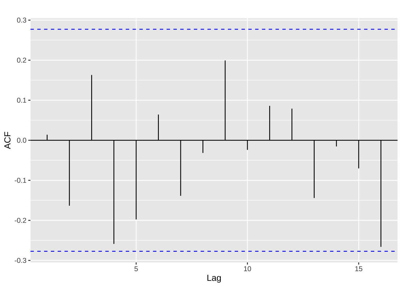
上述的例子中,\(T=50\),95%置信水平下的边界为\(\pm 2/\sqrt{50}=\pm0.28\),可由图推断出该序列为白噪声。
对于未来未知的时间区间,我们总是希望通过一定的预测估计,能够更好的管理配置当下的资源。我们可使用一些基本的方法来实现预测:
根据该名称就可判断:
\[ \hat{y}_{T+h|T} = \bar{y} = (y_{1}+\dots+y_{T})/T \]
\(\hat{y}_{T+h|T}\)表示的是基于\(y_1,\cdots,y_T\)对\(y_{T+h}\)的估计。
直接用上一期的观测值对下一期进行预测,即
\[ \hat{y}_{T+h|T} = y_{T} \]
h=1
naive(y, h)
Point Forecast Lo 80 Hi 80 Lo 95 Hi 95
51 -0.6714844 -2.637165 1.294196 -3.677734 2.334765rwf(y, h) # 二者等价 Point Forecast Lo 80 Hi 80 Lo 95 Hi 95
51 -0.6714844 -2.637165 1.294196 -3.677734 2.334765趋势法(漂移法)允许预测值随着时间的推移增大或减小,并且我们假定单位时间改变量(称作 “漂移”)等于历史数据的平均改变量,因此\(T+h\)时刻的预测值可以表示为:
\[ \hat{y}_{T+h|T} = y_{T} + \frac{h}{T-1}\sum_{t=2}^T (y_{t}-y_{t-1}) = y_{T} + h \left( \frac{y_{T} -y_{1}}{T-1}\right) \]
rwf(y, h, drift=TRUE) Point Forecast Lo 80 Hi 80 Lo 95 Hi 95
51 -0.6588919 -2.665039 1.347255 -3.727029 2.409245# 画出预测图
autoplot(goog200) +
autolayer(meanf(goog200, h=40), PI=FALSE, series="Mean") +
autolayer(rwf(goog200, h=40), PI=FALSE, series="Naïve") +
autolayer(rwf(goog200, drift=TRUE, h=40), PI=FALSE, series="drifting") +
ggtitle("Forecast of Google's daily closing price (as of December 6, 2013)") +
xlab("Day") + ylab("closing price(dollar)") +
guides(colour=guide_legend(title="Prediction")) +
theme(text=element_text(family="serif"))+
theme(plot.title = element_text(hjust = 0.5))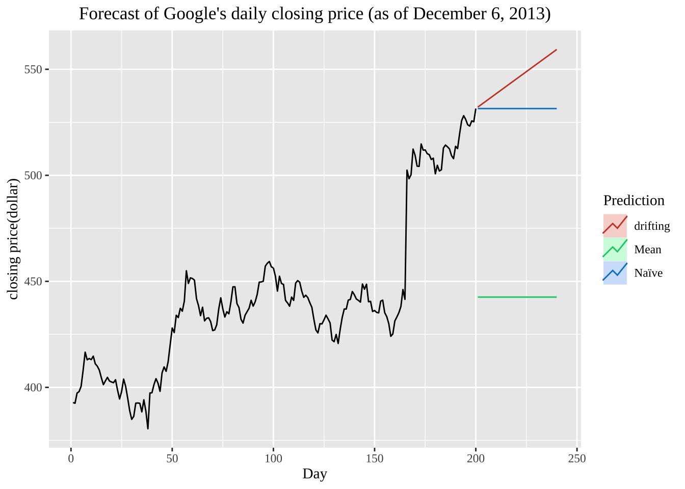
实际运用中简单方法也会有较好的表现,仍然是根据实际的问题出发选择最为适合的方法进行估计。
季节性数据中一些变化可能来自于简单的日历效应。因此我们需要将这种变化进行消除,得到更为monthday()可以帮助我们消除这种影响。
cbind(月均 = milk, 日均=milk/monthdays(milk))%>%
autoplot(facet=TRUE) +
  xlab("Years") + ylab("sterling") +
  ggtitle("Prediction of milk production per cow") +
  theme(text=element_text(family="serif"))+
  theme(plot.title = element_text(hjust = 0.5))
较为简便的模型是线性模型,假设被预测变量与预测变量之间有如下关系:
\[ y_t = \beta_0 + \beta_1 x_t + \varepsilon_t \]
cbind('consumption' = uschange[, "Consumption"],
      'income' = uschange[, "Income"]) %>%
  autoplot(facets = TRUE, colour=TRUE) +
  ylab("Growth rate % ") + xlab("years") +
    theme(text = element_text(family = "serif"))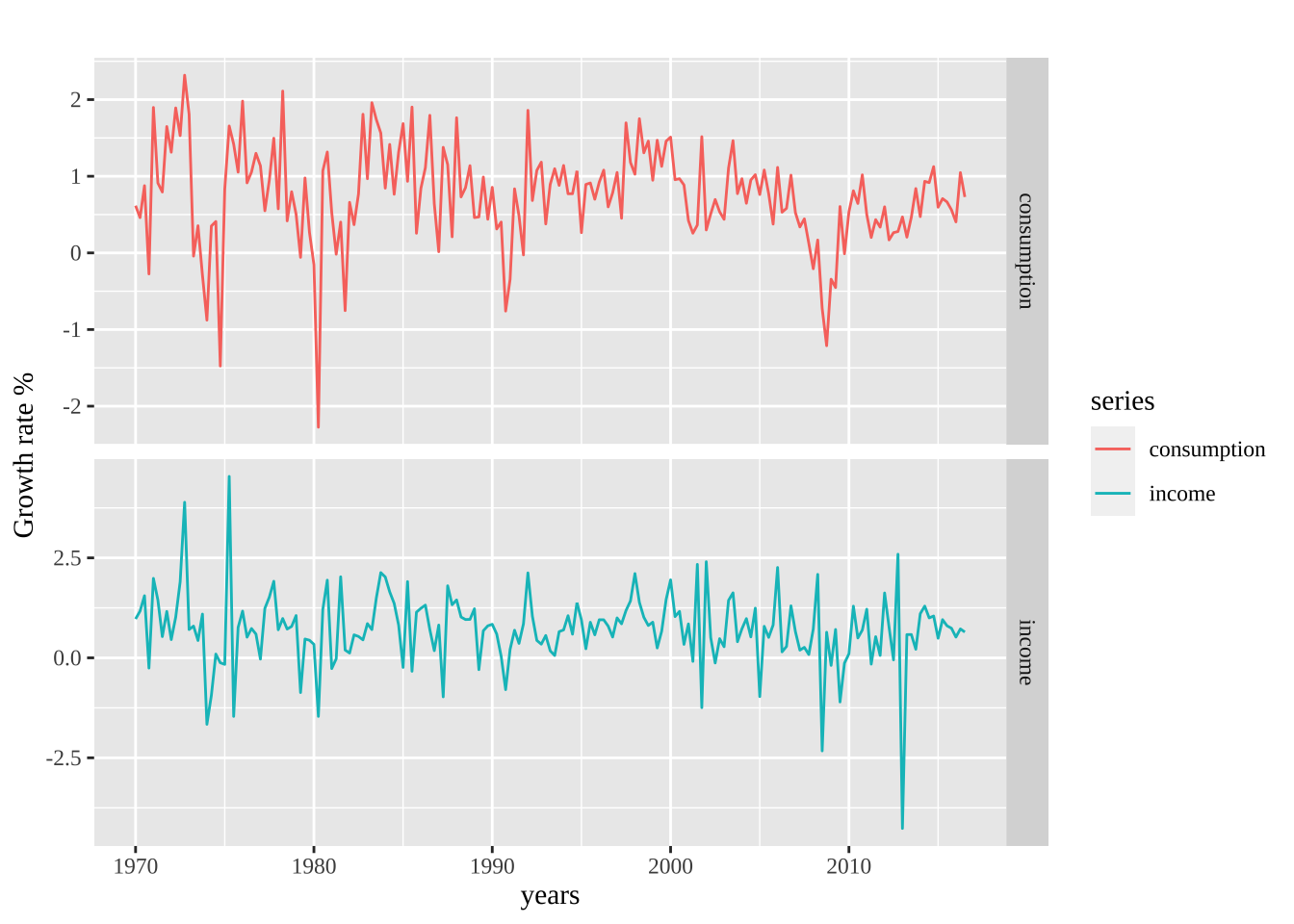
进一步引入更多的变量来进行预测:
我们在前面所述:时间具有趋势性和一些因素以及噪声等构成,因此如何将时间序列进行分解,将时间序列的看作是多个成分的组合: \[ y_{t} = S_{t} + T_{t} + R_t\] 在上式中的\(y_t\)表示的是时间序列数据,\(S_t\)表示季节项。\(T_t\)表示趋势-周期项,\(R_t\)表示残差项。
同时,时间序列分解也可写成乘积的形式: \[ y_{t} = S_{t} \times T_{t} \times R_t \]
\(m\)阶移动平均分解为:
\[\begin{equation} \hat{T}_{t} = \frac{1}{m} \sum_{j=-k}^k y_{t+j} \end{equation}\]
其中的\(m=2k+1\),时间点\(t\)的趋势-周期项是根据\(t\)时刻k周期内的平均得到的。时间临近的情况下,观测值也可能接近。
autoplot(elecsales) + xlab("Year") + ylab("Gwh") +
  ggtitle("Annual electricity sales volume: South Australia")+
  theme(text = element_text(family = "serif"))+
  theme(plot.title = element_text(hjust = 0.5))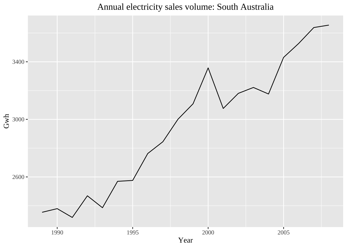
ma(elecsales, 5)Time Series:
Start = 1989
End = 2008
Frequency = 1
[1] NA NA 2381.530 2424.556 2463.758 2552.598 2627.700 2750.622
[9] 2858.348 3014.704 3077.300 3144.520 3188.700 3202.320 3216.940 3307.296
[17] 3398.754 3485.434 NA NAautoplot(elecsales, series="origin data") +
autolayer(ma(elecsales,5), series="5-MA") +
xlab("Year") + ylab("") +
ggtitle("Annual residential electricity sold: South Australia") +
scale_colour_manual(values=c("origin data"="grey50","5-MA"="red"),
breaks=c("origin data","5-MA"))+
theme(text = element_text(family = "serif"))+
theme(plot.title = element_text(hjust = 0.5))Warning: Removed 4 rows containing missing values (`geom_line()`).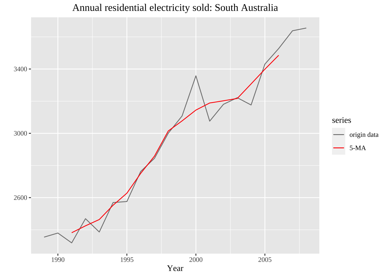
autoplot(elecequip, series="origin data") +
  autolayer(ma(elecequip, 12), series="12-MA") +
  xlab("years") + ylab("new contract index") +
  ggtitle("Electrical equipment manufacturing(European)") +
  scale_colour_manual(values=c("original data"="grey","12-MA"="red"),
    breaks=c("origin data","12-MA"))+
  theme(text = element_text(family = "serif"))+
  theme(plot.title = element_text(hjust = 0.5))
Warning: Removed 12 rows containing missing values (`geom_line()`).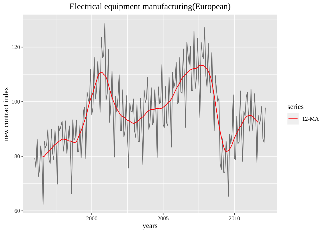
m-MA加权平均:
\[ \hat{T_t} = \sum_{j=-k}^k a_j y_{t+j}, \]
一共包括四种调整模型,加法、乘法、伪加法
library(seasonal)
elecequip %>% seas(x11="") %>%
autoplot() +
  ggtitle("X11 decomposition of electrical equipment index")+
  theme(text = element_text(family = "serif"))+
  theme(plot.title = element_text(hjust = 0.5))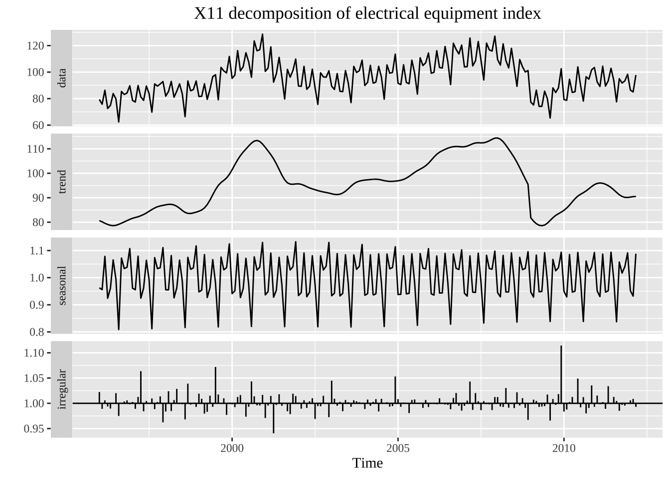
\[ Y_t=TC \] 核心算法:趋势项季节项找出之后进行拆分 中心化12项移动平均计算平均趋势循环要素的初始估计:
通过3*3的移动平均计算季节因子S
消除季节因子中的残余趋势
季节调整结果的初始估计
\[ TCI=Y_t-S \]
仅仅将季节调整之后的过滤,
第二阶段:计算暂定的趋势循环要素和最后的季节因子
第三阶段:
每天的经济活动总和会对于现有的时间月度数据产生影响,这种称为是贸易日影响。
移动节假日和genhol程序
ARIMA模型 仍然是移动平均的思路