基本绘图
颜色
R中颜色设置主要依靠grDevices 包的支持,其中提供大量颜色选择函数和生成函数。
固定颜色选择函数:R提供的自带固定种类的颜色,主要是colors()以及palette():
pdf ("colors-bar.pdf" , height = 120 )par (mar = c (0 , 10 , 3 , 0 ) + 0.1 , yaxs = "i" )barplot (rep (1 , length (colors ())),col = rev (colors ()), names.arg = rev (colors ()), horiz = TRUE ,las = 1 , xaxt = "n" , main = expression ("Bars of colors in" ~ italic (colors ()))dev.off ()
title()函数用于添加标题,text()函数用于向图形中任意位置添加文本,mtext()函数用于向图中四条边上添加文本。
前面两个参数x和y表示图例的坐标位置(左上角顶点的坐标)
legend参数通常是一个字符向量,表示图例中的文字;
fill参数指定一个与图例字符向量对应的颜色向量用于在文本左边绘制一个颜色填充方块;
col参数设置图例中点和线的颜色
直方图histogram
用于展示连续数据的最好方法
\[ f(x)=F'(x)=\lim_{h\rightarrow0}\frac{F(x+h)-F(x)}{h} \]
茎叶图
同样用于展示数据密度的工具,但刻画略显粗劣;
stem(x,scale=1,width=80,aton=1e-08)
参数scale控制节与节之间的长度;
width控制茎叶图的宽度;
      Africa   Antarctica         Asia    Australia Axel Heiberg       Baffin
       11506         5500        16988         2968           16          184
       Banks       Borneo      Britain      Celebes
          23          280           84           73
其中的
以一个整数表示后面还有多少片叶子没有被画出;
  The decimal point is 3 digit(s) to the right of the |

   0 | 00000000000000000000000000000111111222338
   2 | 07
   4 | 5
   6 | 8
   8 | 4
  10 | 5
  12 |
  14 |
  16 | 0
条形图
par (mfrow = c (2 , 1 ), mar = c (3 , 2.5 , 0.5 , 0.1 ))mar:调整bottom左 top 右的边界宽度(以线的数量来衡量,另一个mai是以inchs来衡量,一般用mar,有default值)
mfrow显示的是subsequent
mfg表示在图中哪一个将会被draw在给出c(i,j)的情况下;
new每叠加一次新图形,运行一次该程序命令,即可实现在原图上继续叠加数据绘图
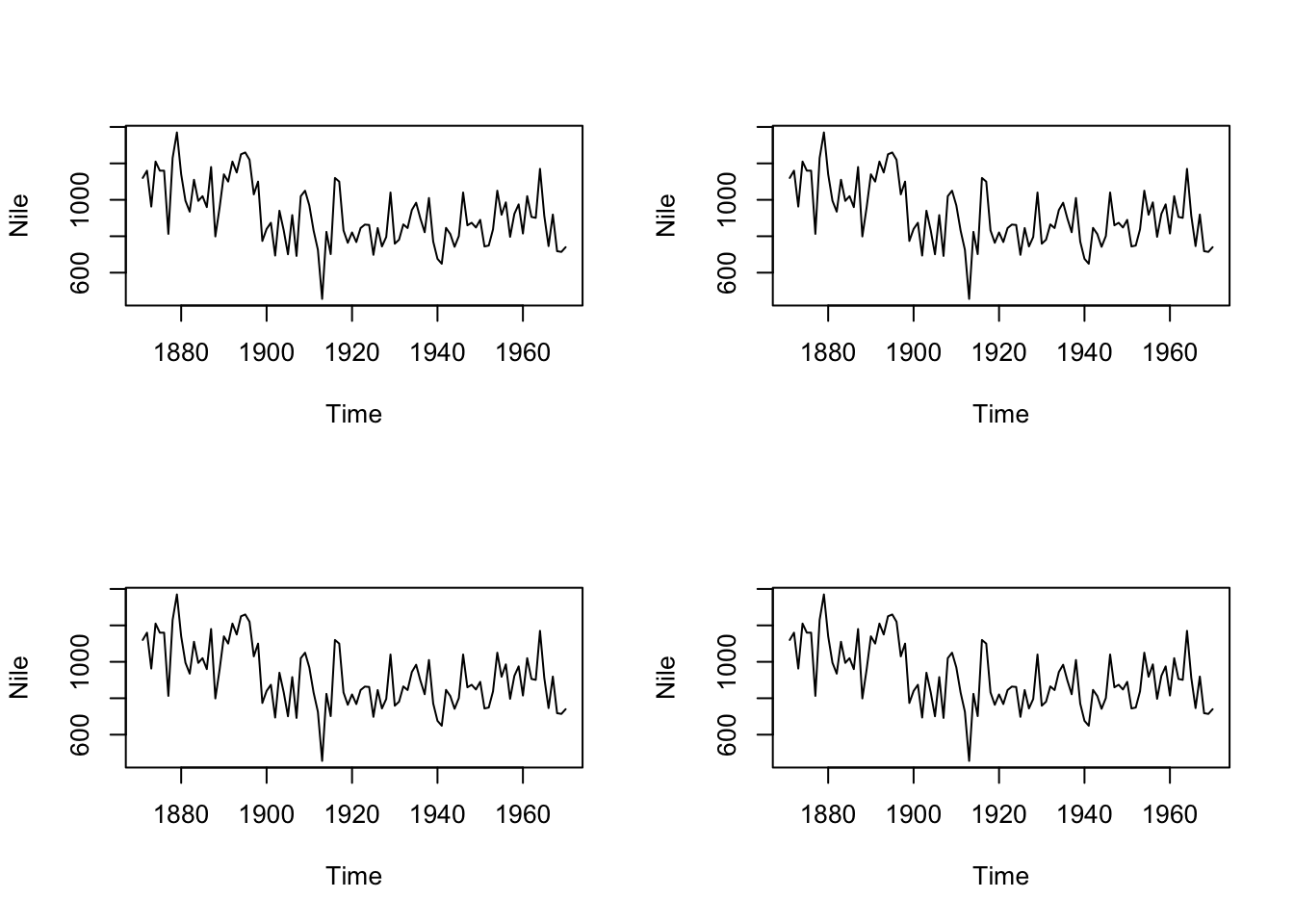
par(mfrow=c(2,2))就可以将多个图出
par (mfrow= c (2 ,2 ))plot (Nile)plot (Nile)plot (Nile)plot (Nile)
2、使用split .screen() 来分割
plot将图重叠在一个坐标系内的方法:
v - 是包含直方图中使用数值的向量。
main - 表示图表的标题。
col - 用于设置条的颜色。
border - 用于设置每个栏的边框颜色。
xlab - 用于描述x轴。
xlim - 用于指定x轴上的值范围。
ylim - 用于指定y轴上的值范围。
breaks - 是用来提及每个栏的宽度。
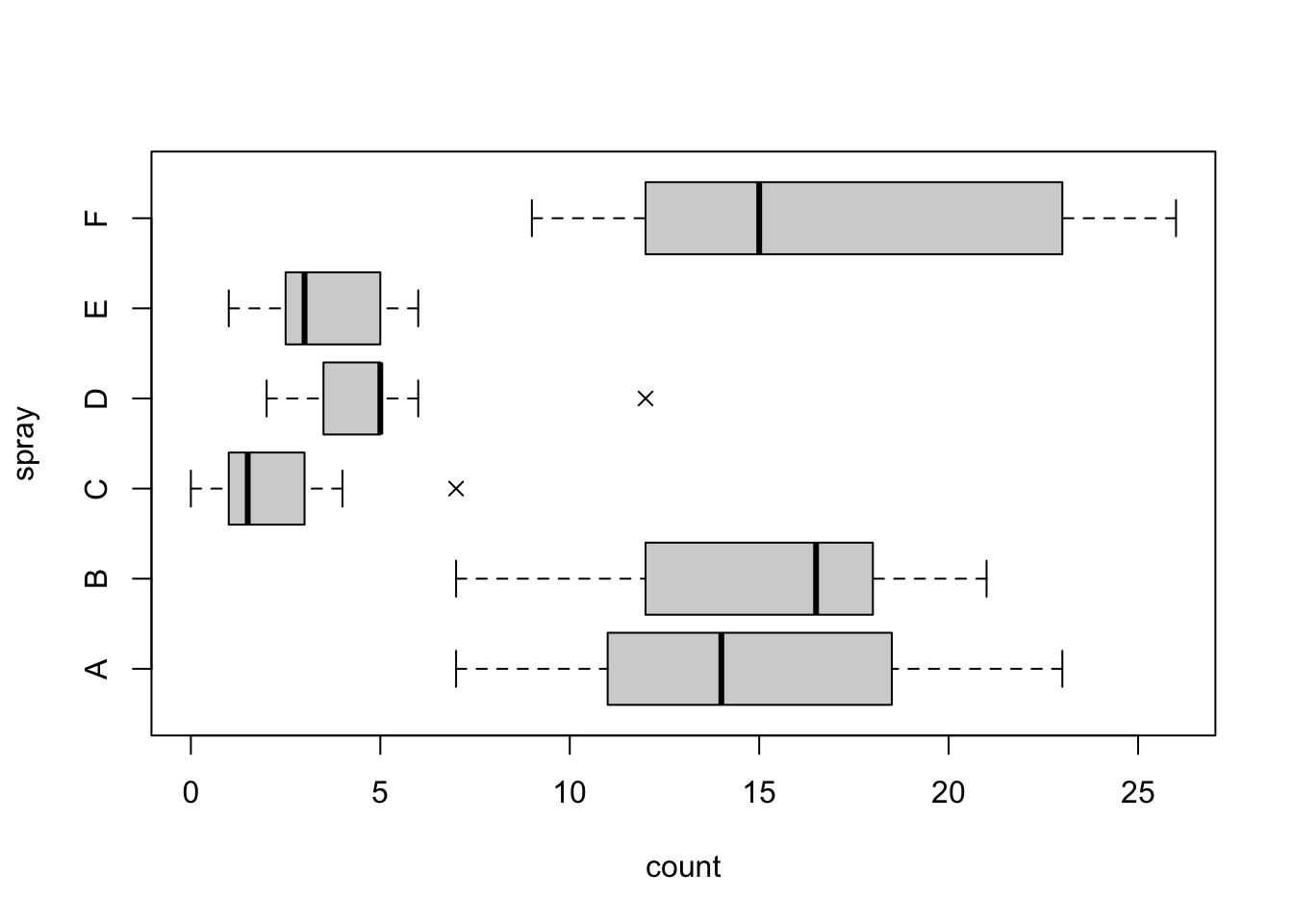
箱线图
R中相应的函数为boxplot()
boxplot()是一个泛型函数,可以适应不同的参数类型。
notch是一个有用的逻辑参数,决定是否在箱子上画凹槽,凹槽所表示的是中位数的一个区间估计,其计算式: \[
Q_2+/-1.58\mathrm{IQR}/\sqrt{n}
\] 区间的置信水平为95%,在比较两组数据中位数差异时候,只需要箱线图的凹槽是否有重叠部分就行;
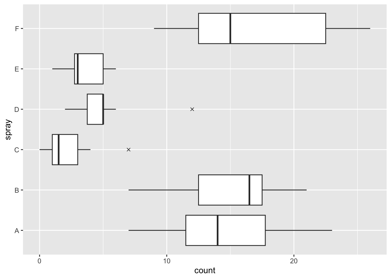
library (ggplot2)boxplot (count ~ spray, data = InsectSprays,col = "lightgray" , horizontal = TRUE , pch = 4 )ggplot (aes (y = count, x = spray), data = InsectSprays) + geom_boxplot (outlier.shape = 4 ) + coord_flip ()
散点图
散点图通常用于表示两个变量之间的关系;
图中每一个点的横纵坐标都分别对应两个变量各自的观测值,因此散点所反映出来的趋势也就是两个变量之间的关系;
R中散点图的函数为plot.default()但由于plot()是泛形,通常只需要提供两个数值型向量给plot()即可;
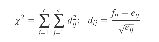
关联图
关联图是展示二维列联表数据的一种工具,主要基于列联表的独立性检验理论生成的图形;
对于一个\(r\times c\) 列联表,\[ \chi^{2} \] 统计量的定义为如下平方和形式:
其中,\(f_{ij}\) 为单元格中观测频数,\(e_{ij}\) 为期望频数;两者相差越大,则会导致检验统计量的值越大,说明行变量和列变量越不独立;
R中关联图的函数assocplot()
<- margin.table (HairEyeColor, c (1 , 2 ))
       Eye
Hair    Brown Blue Hazel Green
  Black    68   20    15     5
  Brown   119   84    54    29
  Red      26   17    14    14
  Blond     7   94    10    16
assocplot (x, main = "Relation between hair and eye color" )
条件密度图
条件密度图:展示的是一个变量的条件密度,或一个分类变量\(Y\) 相对于一个连续变量\(X\) 的条件密度\(P(Y|X)\) ;
条件分割图
给定某一个或几个变量之后看所关心的变量的分布情况,分布主要指两个变量之间的关系,通常以散点图的形式展开:
分割图的函数: coplot()
社会网络图
layout 布局
设置成特定形状的网络图
另一种是基于各种算法的优化,主要目的是在于均匀分布节点,使边长度均匀,最小化交叉;
颜色选择
colors()命令返回R中所有可能的颜色列表;
同配性 assortativity
该节点在多大程度上会与同类型或者不同类型的其他节点进行匹配,可以通过一种相关性统计量(所谓的同配系数)进行量化。
聚类系数 Clustering cofficient
三元闭包体现了社会网络的”传递性”(transitivity),枚举所有节点三元组中构成三角形的比值来表征。
模体
网络中的频繁子图模式
网络聚类系数的分布,用来检验社会网路的聚集性上
操作网络数据
找出R中所有的自建的数据集:
print(data(package='fda'))
进一步使用数据集内的数据:
library(mlbench)
print(data(package="mlbench"))
实际操作mlbench改为所需package名
数据可视化
可视化和数据转换的方法实现探索数据,统计学家称为是一个探索性数据分析(exploratory data analysis,EDA) 同时这是一个循环可迭代的问题:
对数据提出问题
对数据进行可视化
使用上一个步骤的结果来精炼问题,并提出新问题。
准备工作
── Attaching packages ─────────────────────────────────────── tidyverse 1.3.2 ──
✔ tibble  3.1.8     ✔ dplyr   1.1.0
✔ tidyr   1.3.0     ✔ stringr 1.5.0
✔ readr   2.1.4     ✔ forcats 0.5.2
✔ purrr   1.0.1
── Conflicts ────────────────────────────────────────── tidyverse_conflicts() ──
✖ dplyr::filter() masks stats::filter()
✖ dplyr::lag()    masks stats::lag()
EDA本质是一个创造的过程,问题的质量在于问题的数量。定义几个变量:
数据导入
使用readr来实现。readr中的多数函数用于平面文件转换为数据框。
read_csv()
read_fwf()读取固定宽度的文件。
library (readr)<- read_csv ("M2_IFI_Data_Basket.csv" )
Rows: 1000 Columns: 18
── Column specification ────────────────────────────────────────────────────────
Delimiter: ","
chr (14): Payment, Gender, Tenant, Fruits & vegetables, Meat, Milk products,...
dbl  (4): Card num., Amount, Income, Age

ℹ Use `spec()` to retrieve the full column specification for this data.
ℹ Specify the column types or set `show_col_types = FALSE` to quiet this message.
# A tibble: 6 × 18
`Card num.` Amount Payment Gender Tenant Income Age Fruits &…¹ Meat Milk …²
<dbl> <dbl> <chr> <chr> <chr> <dbl> <dbl> <chr> <chr> <chr>
1 39808 427. Cheque M Yes 270000 46 No Yes Yes
2 67362 254. Cash F Yes 300000 28 No Yes No
3 10872 206. Cash M Yes 132000 36 No No No
4 26748 237. Card F Yes 122000 26 No No Yes
5 91609 188. Card M No 110000 24 No No No
6 26630 465. Card F Yes 150000 35 No Yes No
# … with 8 more variables: `Canned vegetables` <chr>, `Canned meat` <chr>,
# `Frozen goods` <chr>, Beer <chr>, Wine <chr>, `Soda drinks` <chr>,
# Fish <chr>, Textile <chr>, and abbreviated variable names
# ¹`Fruits & vegetables`, ²`Milk products`
同样对于一个类似于生成数据框的功能
read_csv ("a,b,c 1,2,3 4,5,6" )
Rows: 2 Columns: 3
── Column specification ────────────────────────────────────────────────────────
Delimiter: ","
dbl (3): a, b, c

ℹ Use `spec()` to retrieve the full column specification for this data.
ℹ Specify the column types or set `show_col_types = FALSE` to quiet this message.
# A tibble: 2 × 3
      a     b     c
  <dbl> <dbl> <dbl>
1     1     2     3
2     4     5     6
read_csv ("the first line of metadata the second line of metadata 1,2,3 4,5,6" ,skip= 2 )
Rows: 1 Columns: 3
── Column specification ────────────────────────────────────────────────────────
Delimiter: ","
dbl (3): 1, 2, 3

ℹ Use `spec()` to retrieve the full column specification for this data.
ℹ Specify the column types or set `show_col_types = FALSE` to quiet this message.
# A tibble: 1 × 3
    `1`   `2`   `3`
  <dbl> <dbl> <dbl>
1     4     5     6
readr中skip能够将前几行的数据直接跳过。
数据处理
# A tibble: 150 × 5
   Sepal.Length Sepal.Width Petal.Length Petal.Width Species
          <dbl>       <dbl>        <dbl>       <dbl> <fct>
 1          5.1         3.5          1.4         0.2 setosa
 2          4.9         3            1.4         0.2 setosa
 3          4.7         3.2          1.3         0.2 setosa
 4          4.6         3.1          1.5         0.2 setosa
 5          5           3.6          1.4         0.2 setosa
 6          5.4         3.9          1.7         0.4 setosa
 7          4.6         3.4          1.4         0.3 setosa
 8          5           3.4          1.5         0.2 setosa
 9          4.4         2.9          1.4         0.2 setosa
10          4.9         3.1          1.5         0.1 setosa
# … with 140 more rows
对两个分类变量的相关变动进行可视化表示,需要计算出每个变量组合的观测数量。(同时geom_point(color=n)也能实现类似的功能)
ggplot (data= diamonds)+ geom_count (mapping= aes (x= cut,y= color)) #将数量的大小投射到数据点的大小上
提取子集
如$和[[,[[能够按照名称或位置提取变量,$只能按照名称提取变量。
<- tibble (x = runif (5 ),y = rnorm (5 ))$ x
[1] 0.22241212 0.48421798 0.00574316 0.39895075 0.63712201
[1] 0.22241212 0.48421798 0.00574316 0.39895075 0.63712201
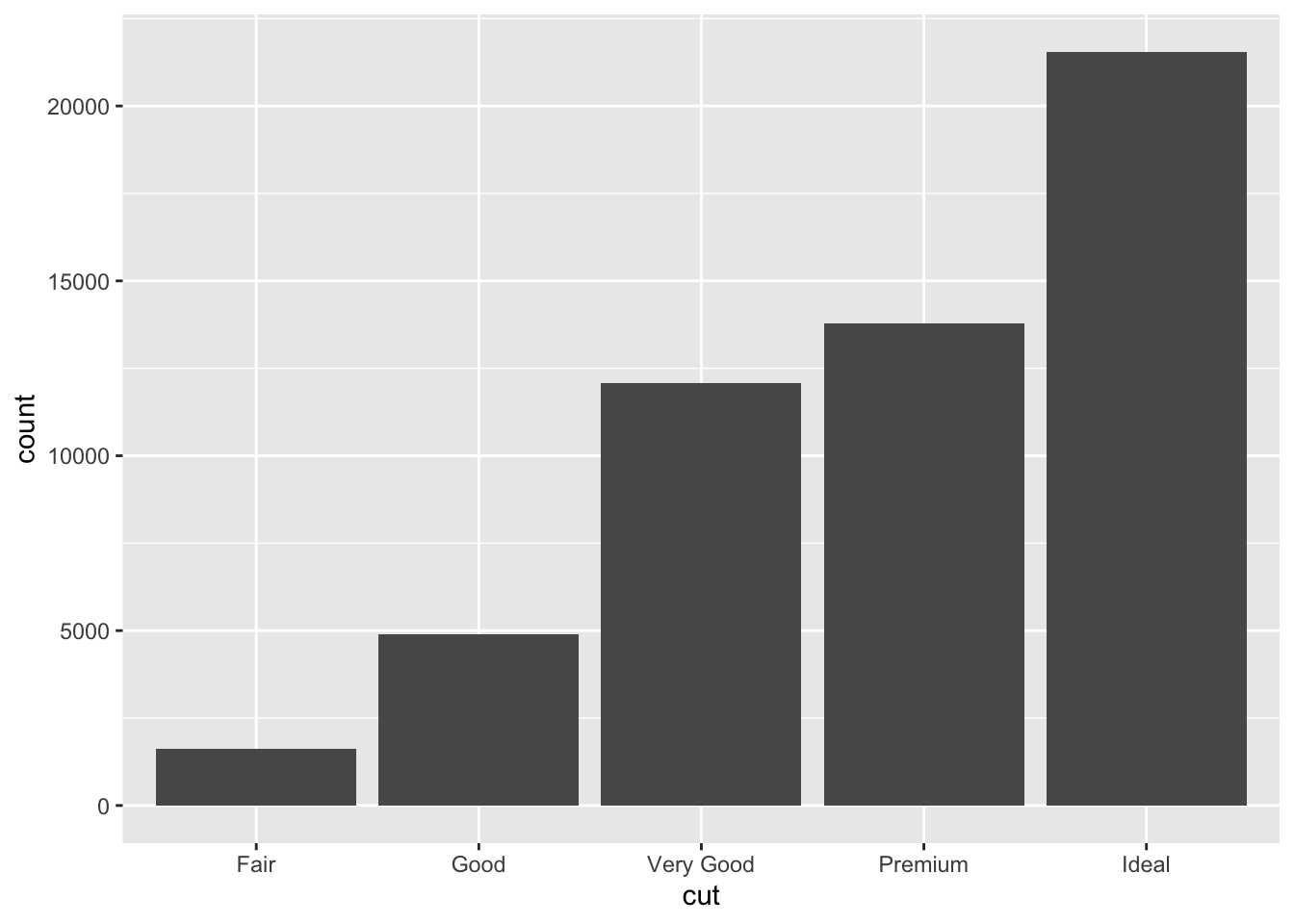
ggplot (data= diamonds)+ geom_bar (mapping= aes (x= cut))
# A tibble: 5 × 2
  cut           n
  <ord>     <int>
1 Fair       1610
2 Good       4906
3 Very Good 12082
4 Premium   13791
5 Ideal     21551
通过dplyr::count()手动计算结果。
使用binwidth参数设定直方图中的间隔的宽度,参数是用x轴变量的单位来衡量的。使用直方图时候,试验不同的宽度对于其的影响。
:: filter (flights,month== 1 ,day== 1 )
# A tibble: 842 × 19
year month day dep_time sched_de…¹ dep_d…² arr_t…³ sched…⁴ arr_d…⁵ carrier
<int> <int> <int> <int> <int> <dbl> <int> <int> <dbl> <chr>
1 2013 1 1 517 515 2 830 819 11 UA
2 2013 1 1 533 529 4 850 830 20 UA
3 2013 1 1 542 540 2 923 850 33 AA
4 2013 1 1 544 545 -1 1004 1022 -18 B6
5 2013 1 1 554 600 -6 812 837 -25 DL
6 2013 1 1 554 558 -4 740 728 12 UA
7 2013 1 1 555 600 -5 913 854 19 B6
8 2013 1 1 557 600 -3 709 723 -14 EV
9 2013 1 1 557 600 -3 838 846 -8 B6
10 2013 1 1 558 600 -2 753 745 8 AA
# … with 832 more rows, 9 more variables: flight <int>, tailnum <chr>,
# origin <chr>, dest <chr>, air_time <dbl>, distance <dbl>, hour <dbl>,
# minute <dbl>, time_hour <dttm>, and abbreviated variable names
# ¹sched_dep_time, ²dep_delay, ³arr_time, ⁴sched_arr_time, ⁵arr_delay
arrange()的工作方式与filter()函数相似,前者不是选择行,而是改变行的顺序。
它接受的一个数据框和一组作为排序依据的列名作为参数。
desc()降序排列
使用管道的多重组合
<- group_by (flights,dest)
# A tibble: 336,776 × 19
# Groups: dest [105]
year month day dep_time sched_de…¹ dep_d…² arr_t…³ sched…⁴ arr_d…⁵ carrier
<int> <int> <int> <int> <int> <dbl> <int> <int> <dbl> <chr>
1 2013 1 1 517 515 2 830 819 11 UA
2 2013 1 1 533 529 4 850 830 20 UA
3 2013 1 1 542 540 2 923 850 33 AA
4 2013 1 1 544 545 -1 1004 1022 -18 B6
5 2013 1 1 554 600 -6 812 837 -25 DL
6 2013 1 1 554 558 -4 740 728 12 UA
7 2013 1 1 555 600 -5 913 854 19 B6
8 2013 1 1 557 600 -3 709 723 -14 EV
9 2013 1 1 557 600 -3 838 846 -8 B6
10 2013 1 1 558 600 -2 753 745 8 AA
# … with 336,766 more rows, 9 more variables: flight <int>, tailnum <chr>,
# origin <chr>, dest <chr>, air_time <dbl>, distance <dbl>, hour <dbl>,
# minute <dbl>, time_hour <dttm>, and abbreviated variable names
# ¹sched_dep_time, ²dep_delay, ³arr_time, ⁴sched_arr_time, ⁵arr_delay
<- summarize (by_dest,count= n (),dist = mean (distance,na.rm= TRUE ),delay= mean (arr_delay,na.rm= TRUE ))
# A tibble: 105 × 4
   dest  count  dist delay
   <chr> <int> <dbl> <dbl>
 1 ABQ     254 1826   4.38
 2 ACK     265  199   4.85
 3 ALB     439  143  14.4
 4 ANC       8 3370  -2.5
 5 ATL   17215  757. 11.3
 6 AUS    2439 1514.  6.02
 7 AVL     275  584.  8.00
 8 BDL     443  116   7.05
 9 BGR     375  378   8.03
10 BHM     297  866. 16.9
# … with 95 more rows
ggplot (data= delay,mapping= aes (x= dist,y= delay))+ geom_point (aes (size= count),alpha= 1 / 3 )+ geom_smooth (se= FALSE )
Warning: Removed 1 rows containing non-finite values (`stat_smooth()`).
Warning: Removed 1 rows containing missing values (`geom_point()`).
另一个将数据传入`ggplot`的方法是使用管道。
<- flights%>% group_by (dest)%>% summarize (count= n (),dist= mean (distance,na.rm= TRUE ),delay= mean (arr_delay,na.rm= TRUE )%>% :: filter (count> 20 ,dest != "HNL" )print (delays)
# A tibble: 96 × 4
   dest  count  dist delay
   <chr> <int> <dbl> <dbl>
 1 ABQ     254 1826   4.38
 2 ACK     265  199   4.85
 3 ALB     439  143  14.4
 4 ATL   17215  757. 11.3
 5 AUS    2439 1514.  6.02
 6 AVL     275  584.  8.00
 7 BDL     443  116   7.05
 8 BGR     375  378   8.03
 9 BHM     297  866. 16.9
10 BNA    6333  758. 11.8
# … with 86 more rows
计数
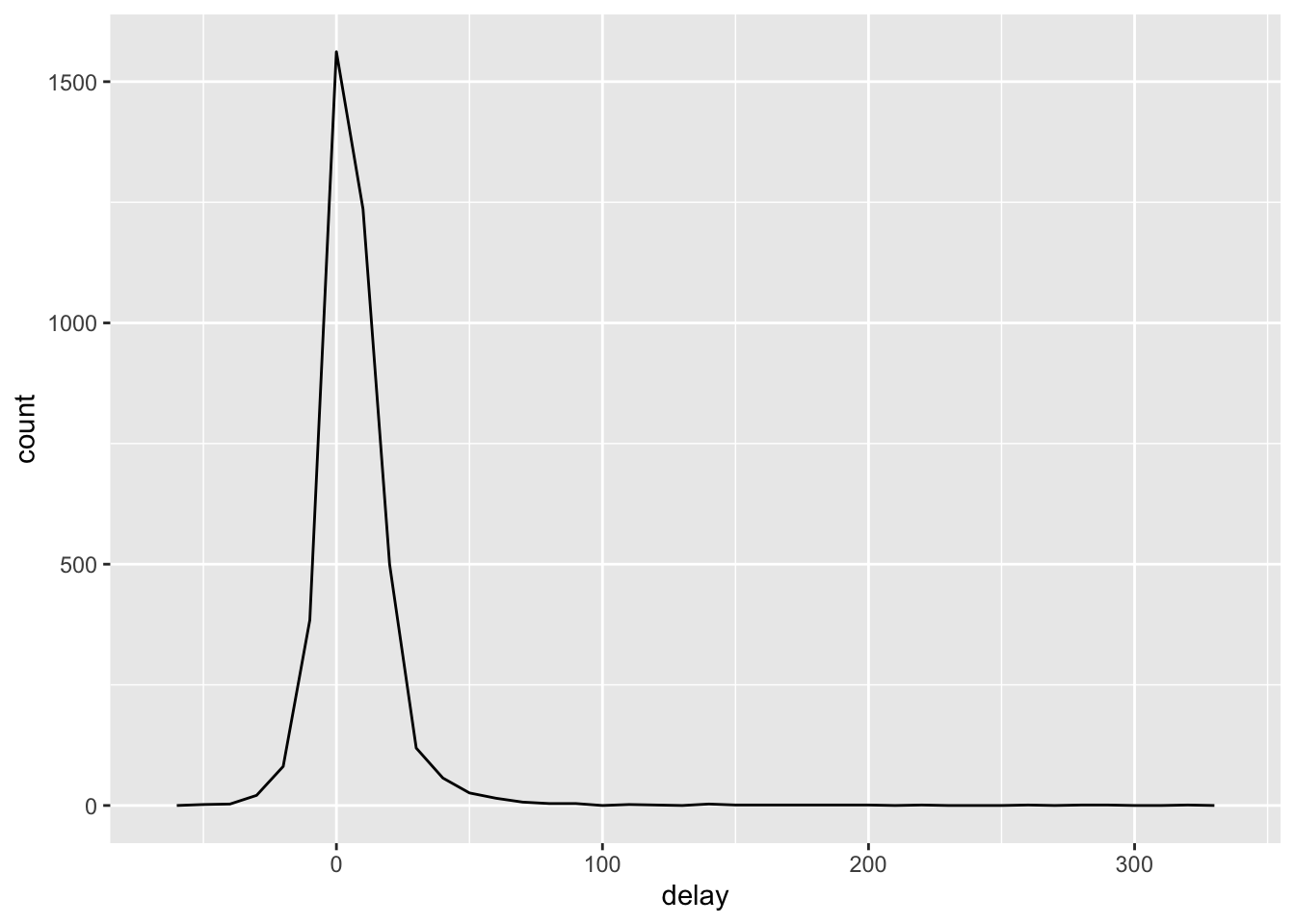
n()或非缺失值的计数sum(!is_na()),可以检查一下是否有少量的数据作为结论。
<- flights%>% :: filter (! is.na (dep_delay),! is.na (arr_delay))
将所有的缺失值的航班数据找出。
<- not_cancelled %>% group_by (tailnum) %>% summarize (delay= mean (arr_delay)
ggplot (data= delays,mapping= aes (x= delay))+ geom_freqpoly (binwidth= 10 )
summarize()实际上是生成了变量能够作为数据框来使用。
异常值
# A tibble: 6 × 10
  carat cut       color clarity depth table price     x     y     z
  <dbl> <ord>     <ord> <ord>   <dbl> <dbl> <int> <dbl> <dbl> <dbl>
1  0.23 Ideal     E     SI2      61.5    55   326  3.95  3.98  2.43
2  0.21 Premium   E     SI1      59.8    61   326  3.89  3.84  2.31
3  0.23 Good      E     VS1      56.9    65   327  4.05  4.07  2.31
4  0.29 Premium   I     VS2      62.4    58   334  4.2   4.23  2.63
5  0.31 Good      J     SI2      63.3    58   335  4.34  4.35  2.75
6  0.24 Very Good J     VVS2     62.8    57   336  3.94  3.96  2.48
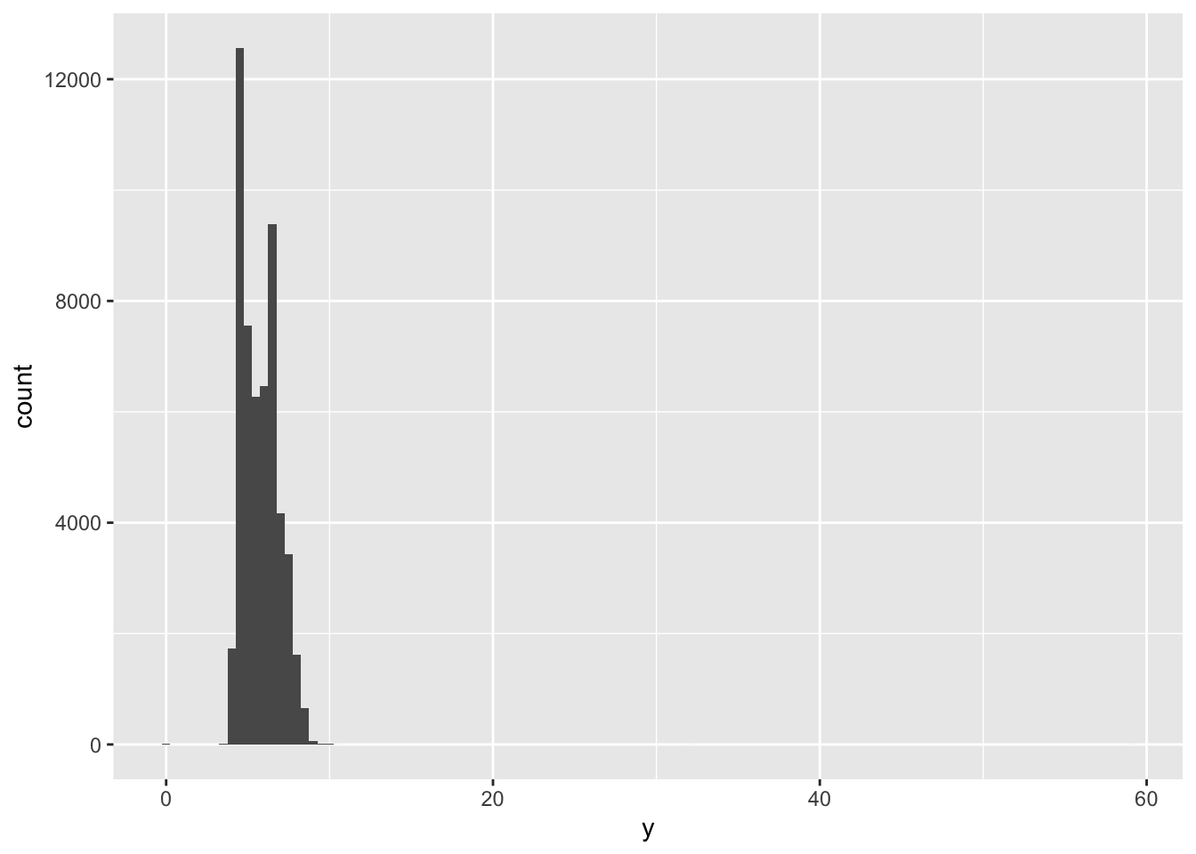
ggplot (diamonds)+ geom_histogram (mapping= aes (x= y),binwidth= 0.5 ) #x坐标表示的是y值的大小,geom_histogram函数将x坐标进行统计再映射到途中。
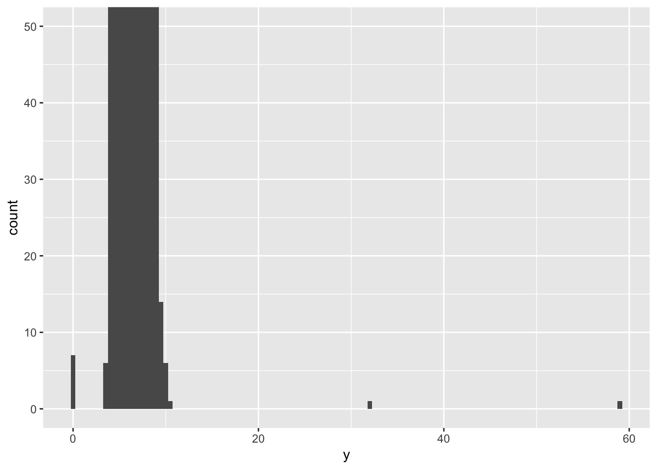
这个分箱导致异常值的分箱高度太低。使用coord_cartesian()将y轴靠近0部分放大
ggplot (diamonds)+ geom_histogram (mapping= aes (x= y),binwidth= 0.5 )+ coord_cartesian (ylim= c (0 ,50 ))
相关变动
来刻画两个变量之间的关系。
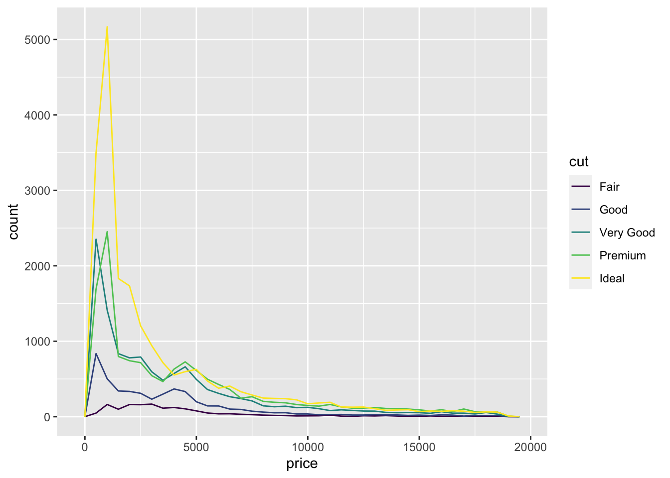
ggplot (data = diamonds, mapping= aes (x = price ))+ geom_freqpoly (mapping= aes (color= cut),binwidth= 500 )
ggplot (diamonds)+ geom_bar (mapping= aes (x= cut))
在ggplot中的箱线图
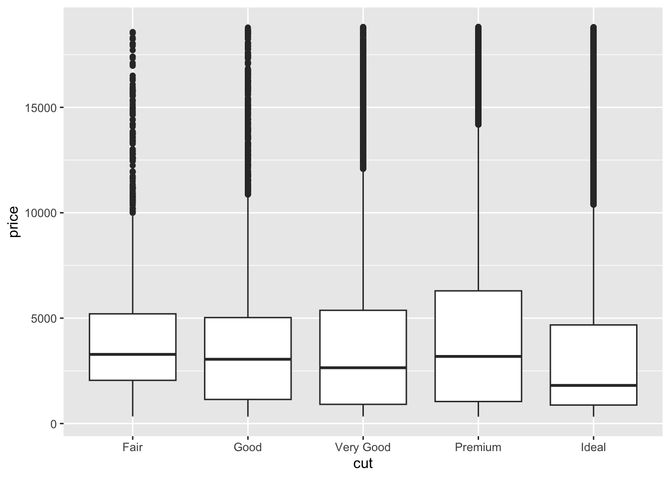
ggplot (data= diamonds,mapping= aes (x= cut,y= price))+ geom_boxplot ()
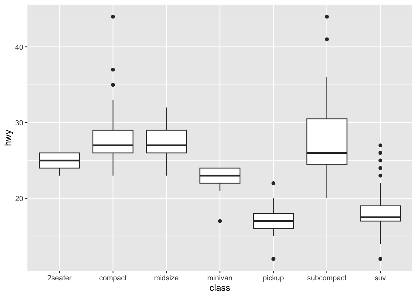
ggplot (data= mpg,mapping= aes (x= class,y= hwy))+ geom_boxplot () #这里对于yx来说属于一个列联表分类数据。
相关性分析图
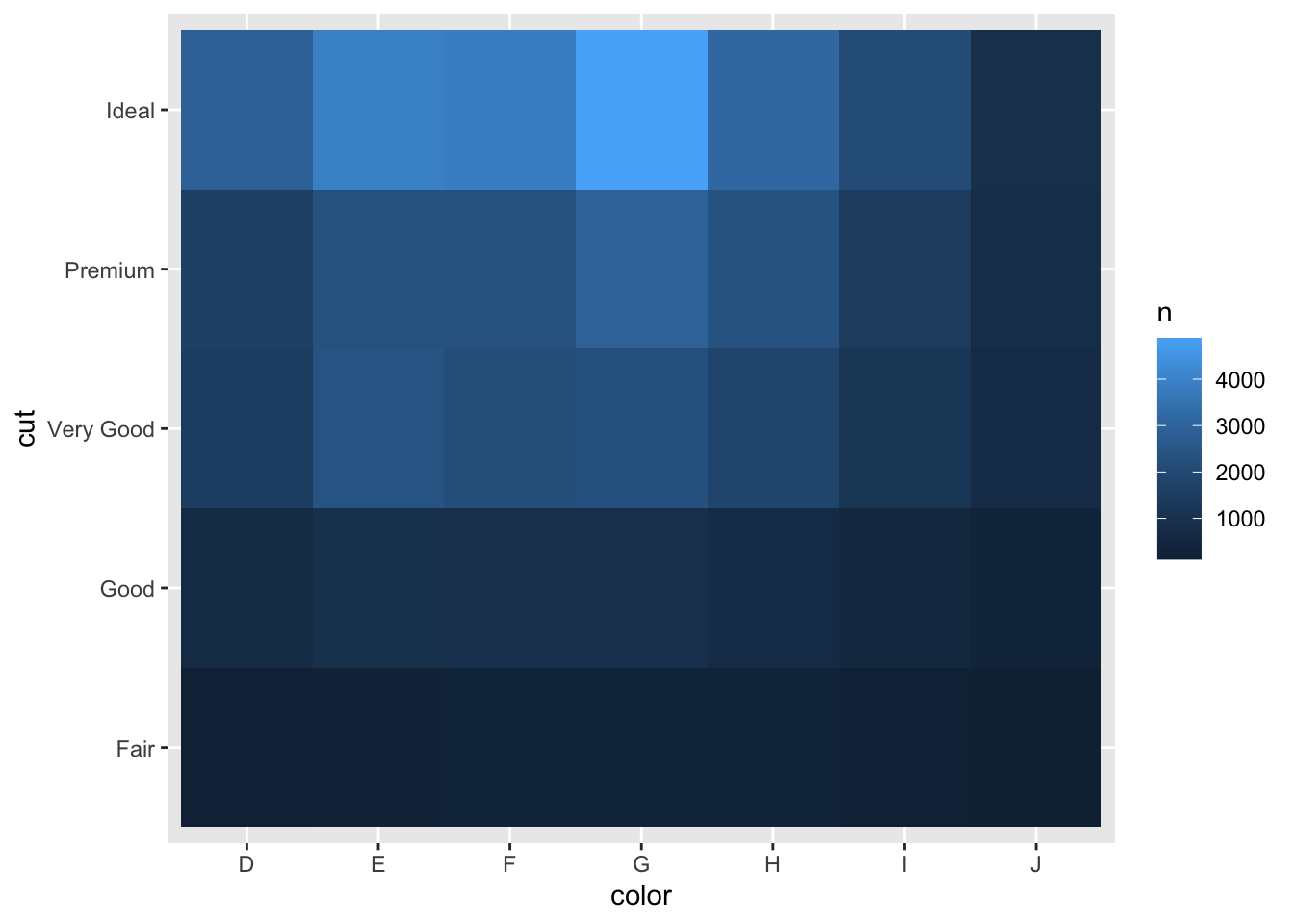
%>% count (color,cut)%>% #计数 ggplot (mapping= aes (x= color,y= cut))+ geom_tile (mapping= aes (fill= n)) #aes()仍然是将fill放入其中
模型
Attaching package: 'modelr'
The following object is masked _by_ '.GlobalEnv':

    heights
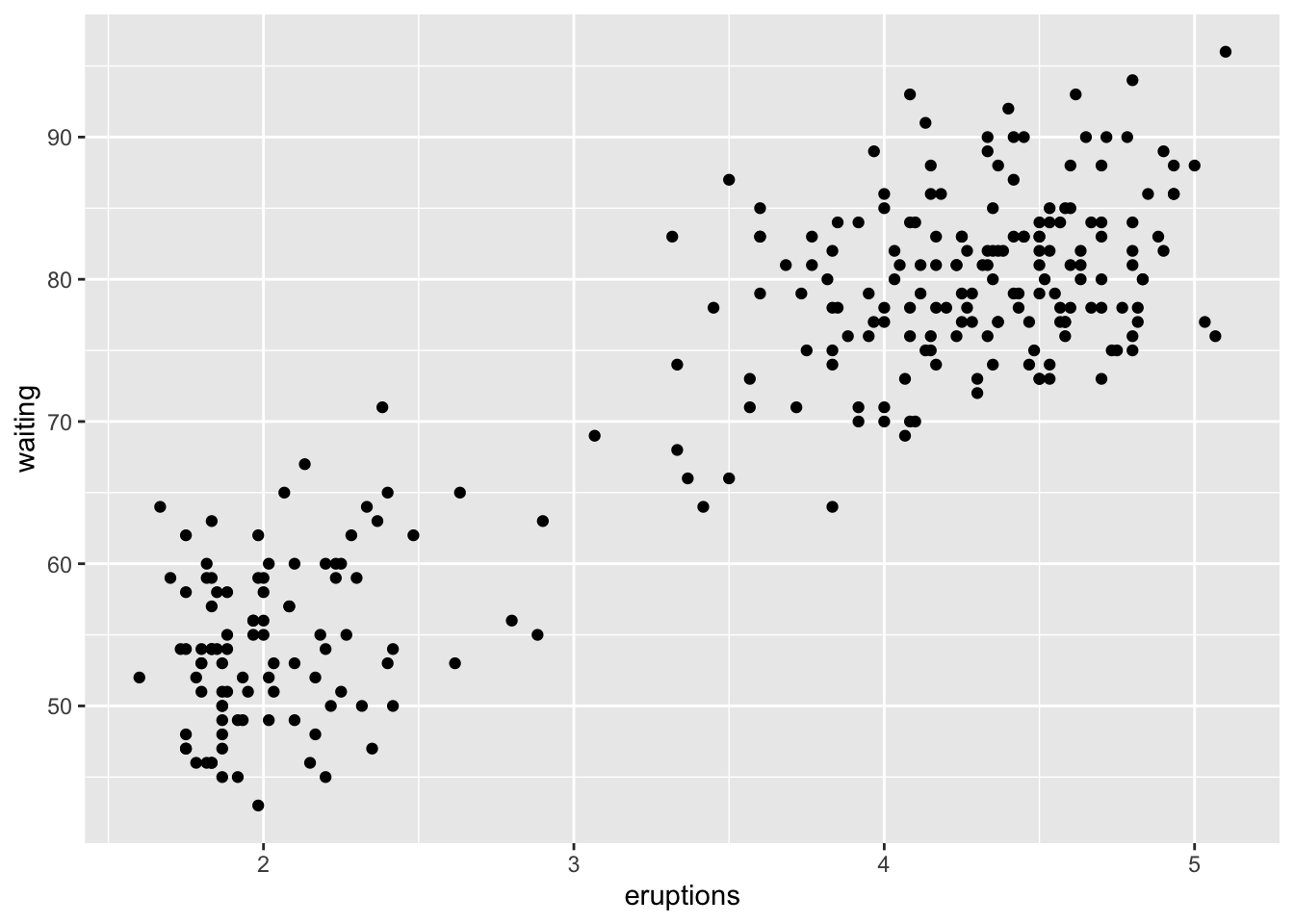
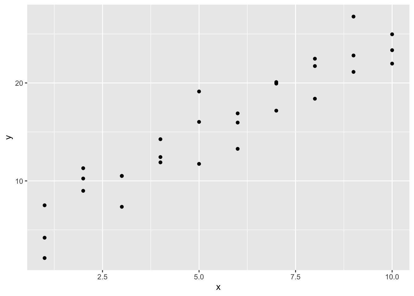
options (na.action= na.warn)ggplot (data= faithful)+ geom_point (mapping= aes (x= eruptions,y= waiting))
ggplot (sim1,aes (x,y))+ geom_point ()
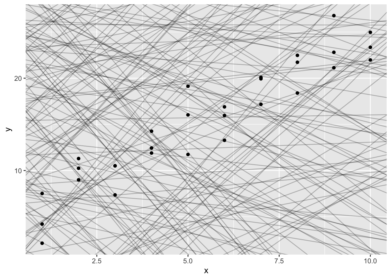
使用geom_abline()作为接受斜率和截距的参数。
<- tibble (a1= runif (250 ,- 20 ,40 ),a2= runif (250 ,- 5 ,5 )
ggplot (sim1,aes (x,y))+ geom_abline (aes (intercept= a1,slope= a2),data= models,alpha= 1 / 4 )+ geom_point ()
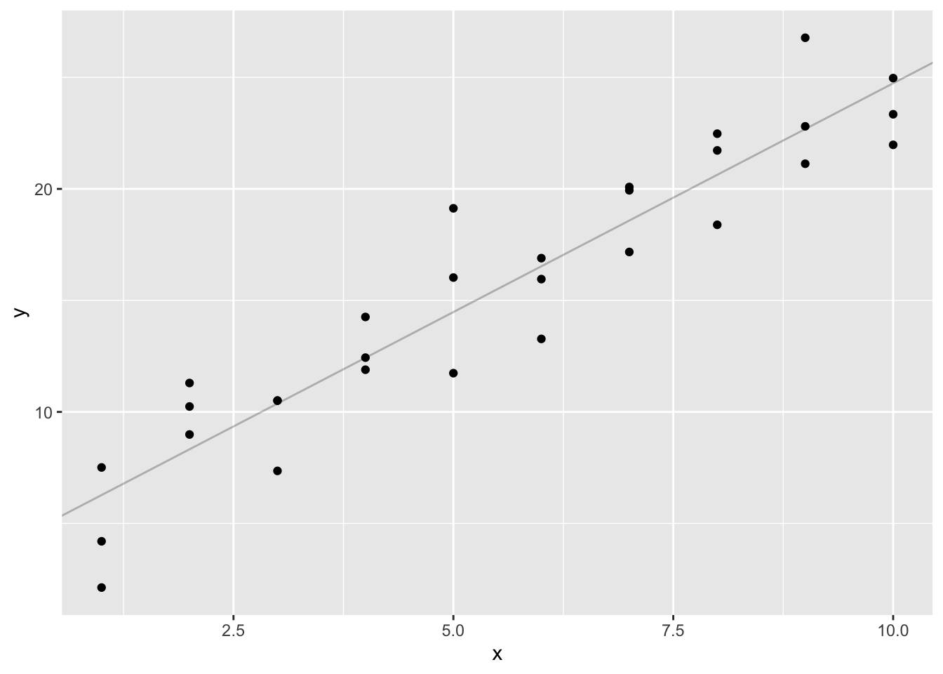
<- function (a,data){1 ]+ data$ x* a[2 ]model1 (c (7 ,1.5 ),sim1)
 [1]  8.5  8.5  8.5 10.0 10.0 10.0 11.5 11.5 11.5 13.0 13.0 13.0 14.5 14.5 14.5
[16] 16.0 16.0 16.0 17.5 17.5 17.5 19.0 19.0 19.0 20.5 20.5 20.5 22.0 22.0 22.0
Call:
lm(formula = sim1$y ~ sim1$x)

Coefficients:
(Intercept)       sim1$x
      4.221        2.052
ggplot (sim1,aes (x,y))+ geom_abline (aes (intercept= 4.221 ,slope= 2.052 ),data= models,alpha= 1 / 4 )+ geom_point ()
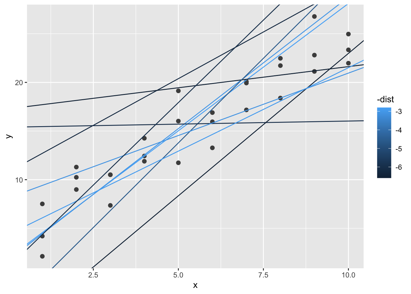
计算RMSE
<- function (mod,data){<- data$ y- model1 (mod,data)sqrt (mean (diff^ 2 ))}measure_distance (c (7 ,1.5 ),sim1)
<- function (a1,a2){measure_distance (c (a1,a2),sim1)<- models%>% mutate (dist= purrr:: map2_dbl (a1,a2,sim1_dist))head (models)
# A tibble: 6 × 3
      a1      a2  dist
   <dbl>   <dbl> <dbl>
1  -4.19 -1.68   31.0
2  35.8   2.39   33.5
3  29.4   2.85   29.8
4  28.2   4.52   38.3
5  -1.25  4.07    8.38
6 -12.1  -0.0289 28.5
ggplot (sim1,aes (x,y))+ geom_point (size= 2 ,color= "grey30" )+ geom_abline (aes (intercept= a1,slope= a2,color= - dist),data= dplyr:: filter (models,rank (dist)<= 10 )
求最优参数
<- optim (c (0 ,0 ),measure_distance,data= sim1)$ par
ggplot修改刻度
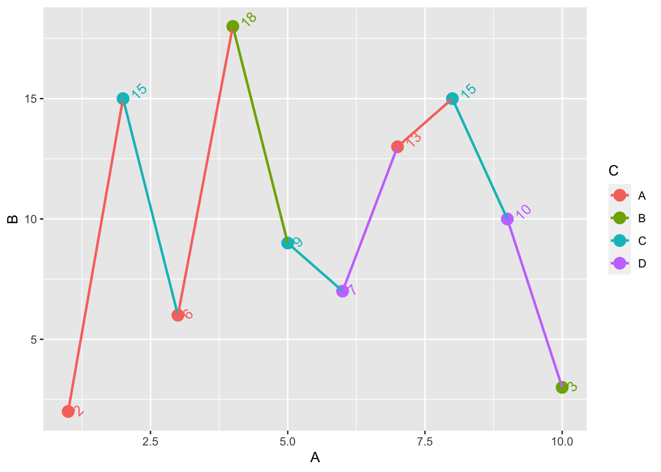
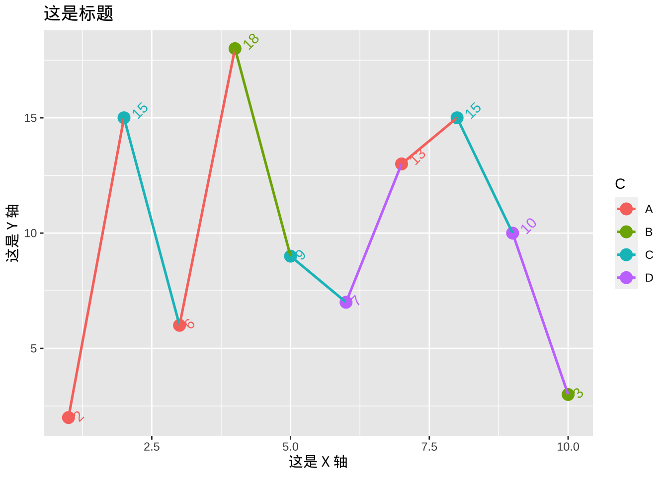
= data.frame (A = 1 : 10 , B = c (2 ,15 ,6 ,18 ,9 ,7 ,13 ,15 ,10 ,3 ), C = c ('A' ,'C' ,'A' ,'B' ,'C' ,'D' ,'A' ,'C' ,'D' ,'B' ))<- ggplot (dt, aes (x = A, y = B, color = C, group = factor (1 ))) + geom_point (size = 3.9 ) + geom_line (size = 0.9 ) + geom_text (aes (label = B, vjust = 1.1 , hjust = - 0.5 , angle = 45 ), show_guide = FALSE ) #添加点的数值
Warning: Using `size` aesthetic for lines was deprecated in ggplot2 3.4.0.
ℹ Please use `linewidth` instead.
Warning: The `show_guide` argument of `layer()` is deprecated as of ggplot2 2.0.0.
ℹ Please use the `show.legend` argument instead.
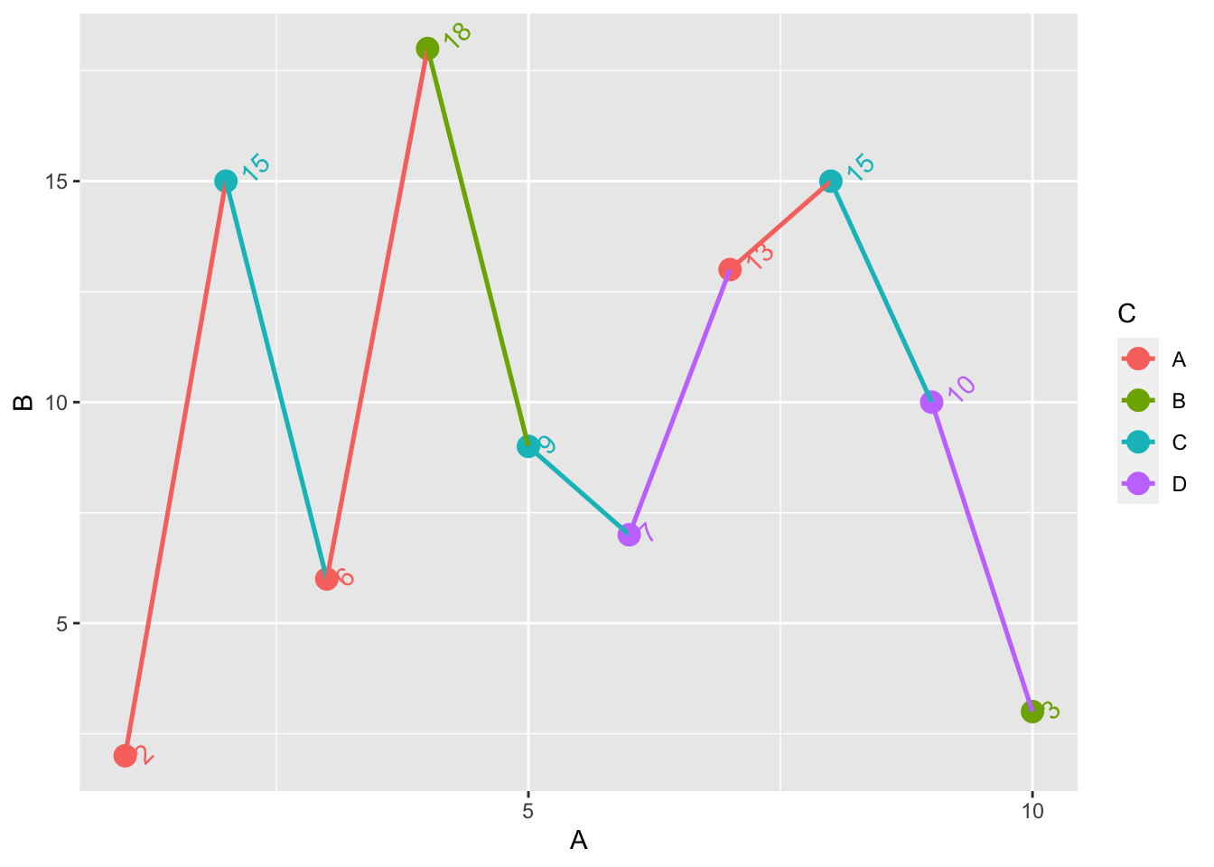
修改坐标轴的显示范围:通过使用scale_x_continuous中的limits中进行设置。
+ scale_x_continuous (limits = c (0 ,12 ))
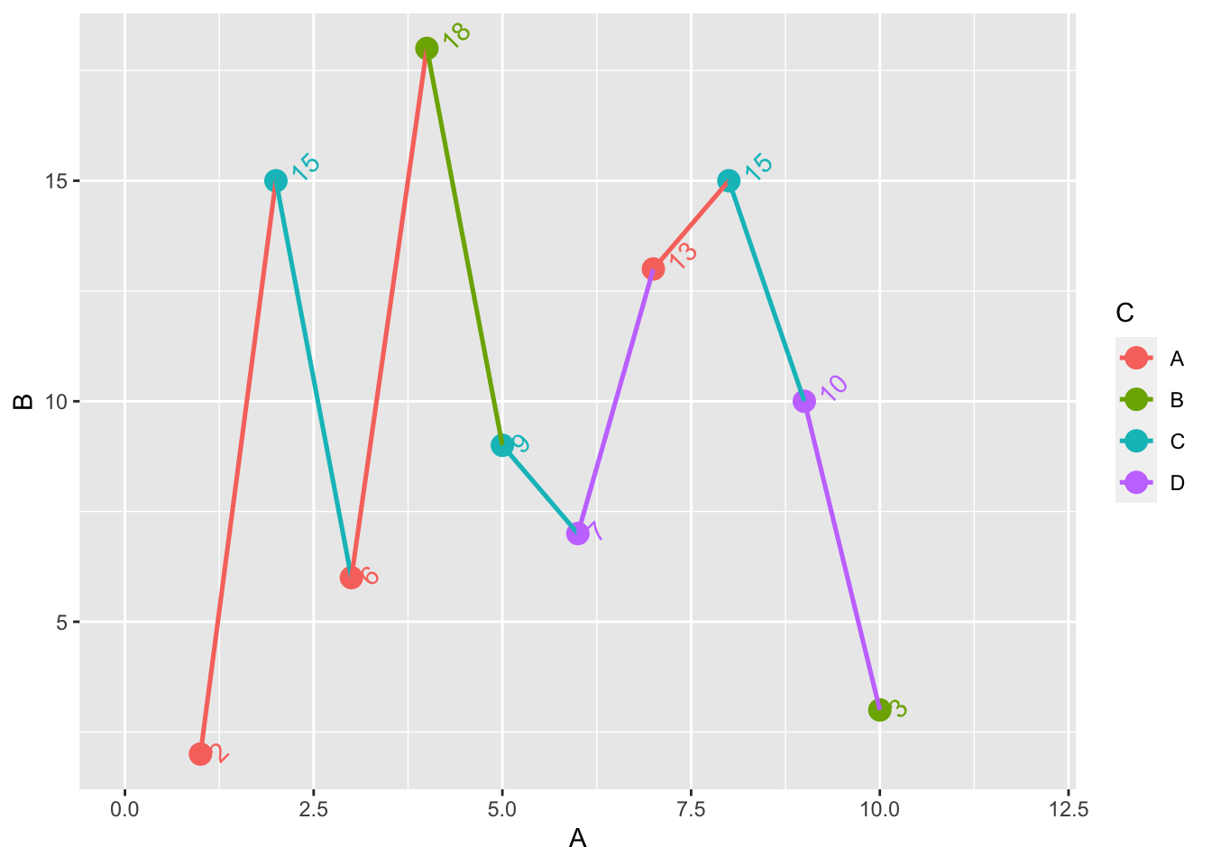
同样若需要调整坐标轴的间隔刻度也是用breaks=的参数实现。
+ scale_x_continuous (breaks= seq (0 , 10 , 5 )) ## X 轴每隔 5 个单位显示一个刻度
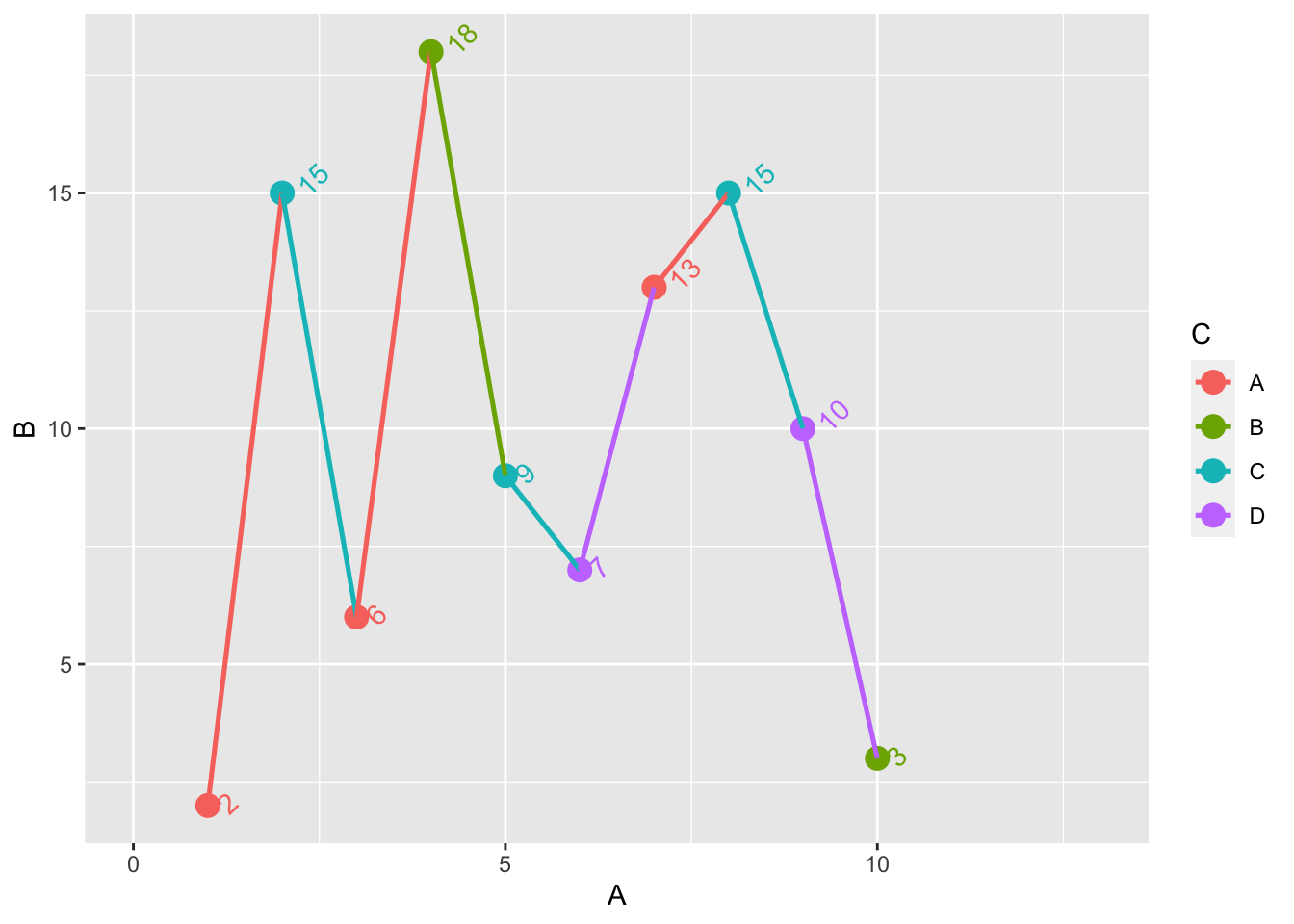
方法二是通过xlim来对x轴的规模进行约束。
抑或是将通过坐标的最大最小值来约束
+ xlim (min (dt$ A, 0 )* 1.2 , max (dt$ A)* 1.2 )
Note:在ggplot绘图中常会遇上中文显示出现空白的问题,常用的一个解决方法是调用包showtext中的showtext_auto()函数。
:: showtext_auto ()
修改坐标轴标签
坐标轴上的标签包括上面的内容、大小、字体、颜色等。 xlab和ylab可以设置坐标轴的内容。ggtitle()用于设置标题。另一个方法是通过labs(x = "", y = "", title = "")来实现。
+ xlab ("这是 X 轴" ) + ylab ("这是 Y 轴" ) + ggtitle ("这是标题" ) + labs (x = "这是 X 轴" , y = "这是 Y 轴" , title = "这是标题" )
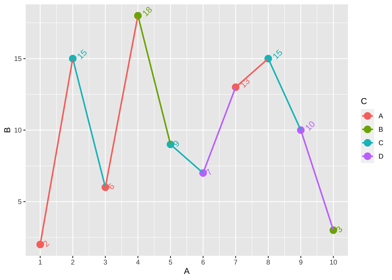
一些默认下的刻度显示并非原始或我们想要的显示内容,若我们需要修改坐标轴刻度上的内容,实际上就是在前文所提到的scale_x_continous中的内容,设置break=,若是原始格式即
+ scale_x_continuous (breaks= dt$ A)
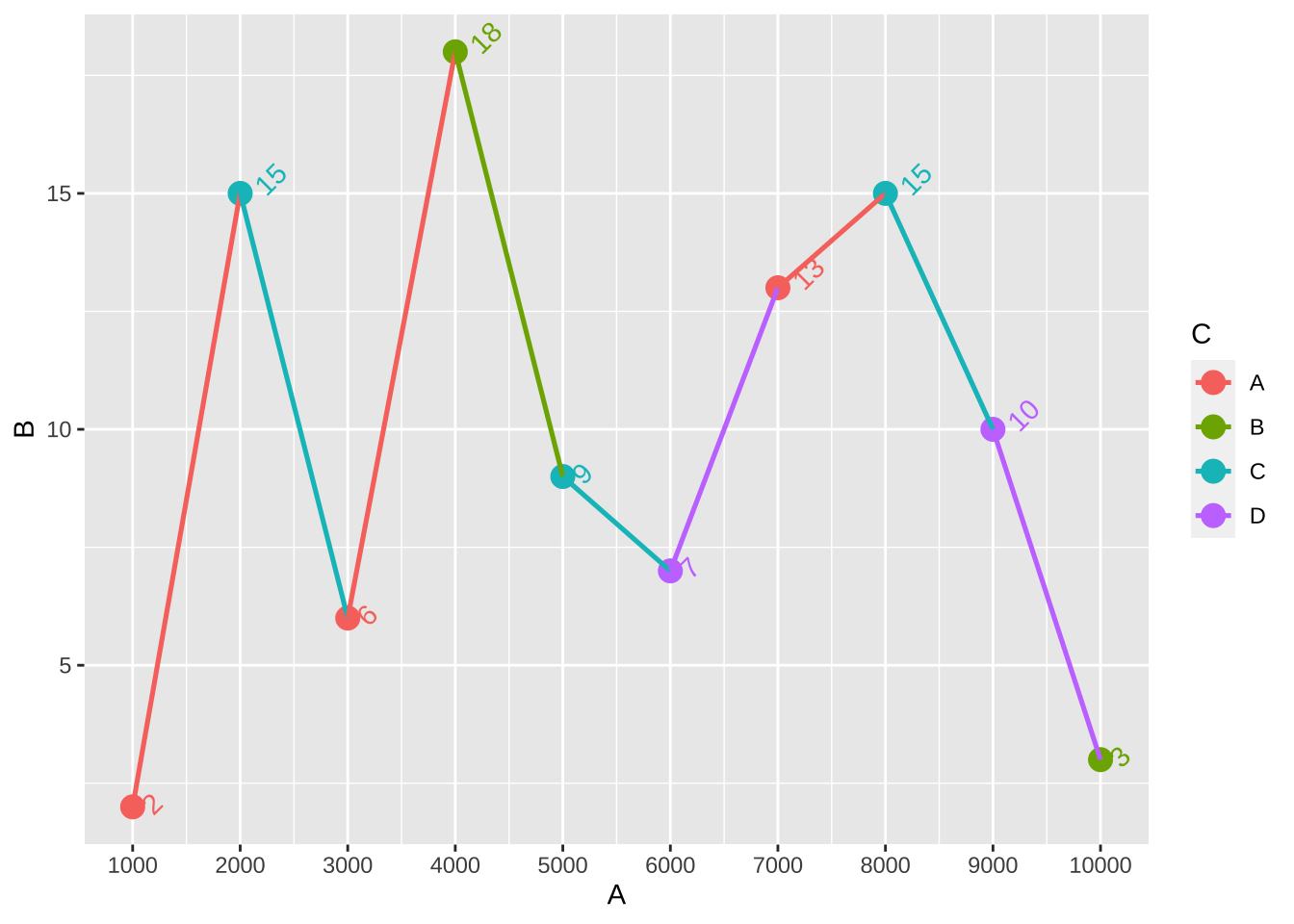
进一步调整坐标轴标签的大小的方式为设置label=
+ scale_x_continuous (breaks= dt$ A, labels = dt$ A* 1000 )
对于y轴也是相同的方法。
设置主题
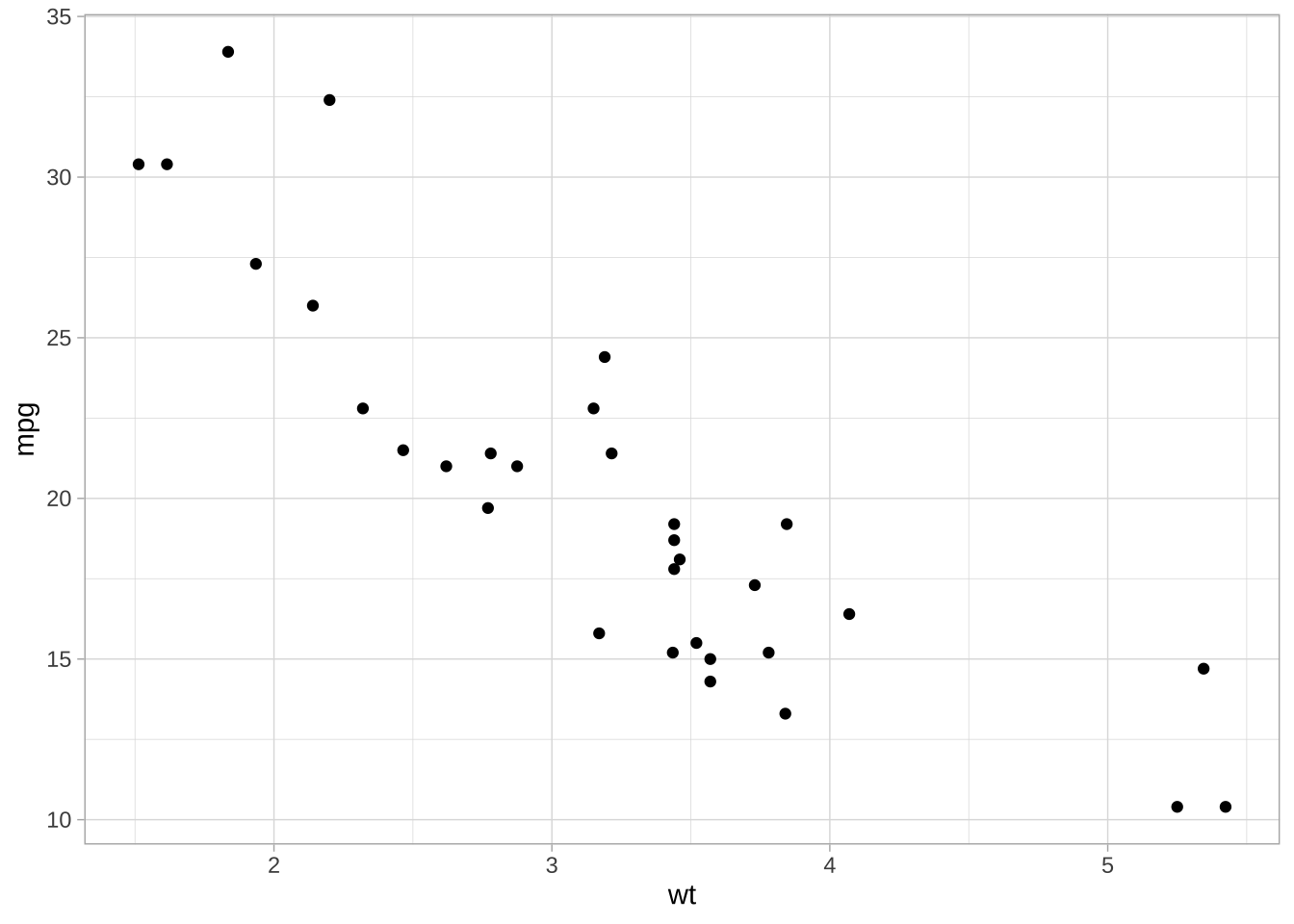
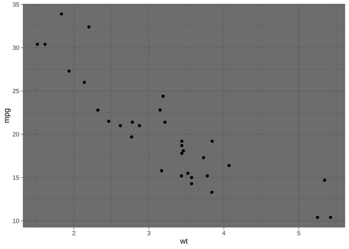
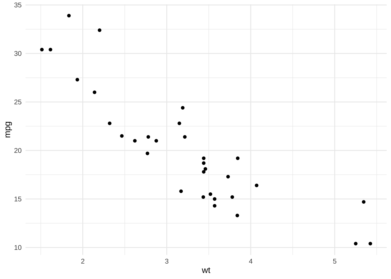
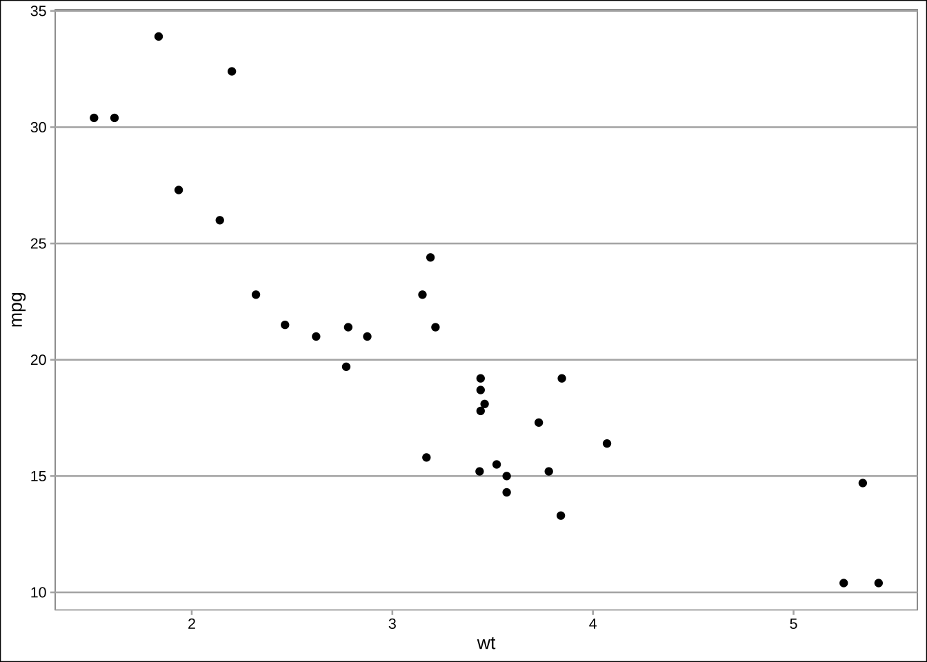
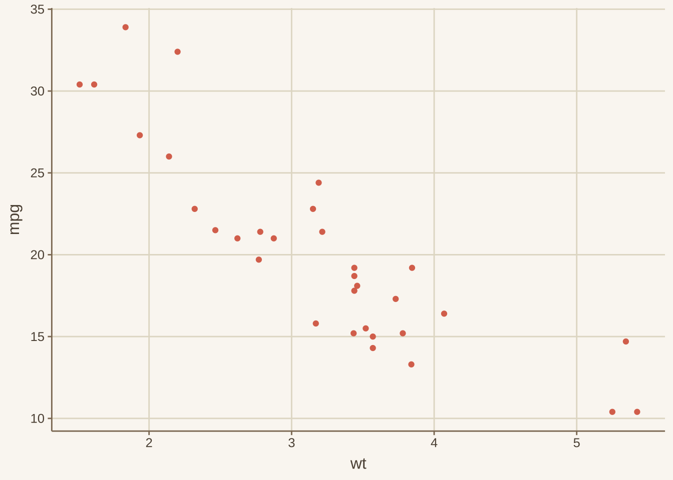
在ggplot中的默认主题为灰色背景theme_gray(),一些情况下需要进行调整主题,而ggplot中有较多内置的主题可以帮助进行选择。
theme_gray () # default theme_bw ()theme_linedraw ()theme_light ()theme_dark ()theme_minimal ()theme_classic ()theme_void ()
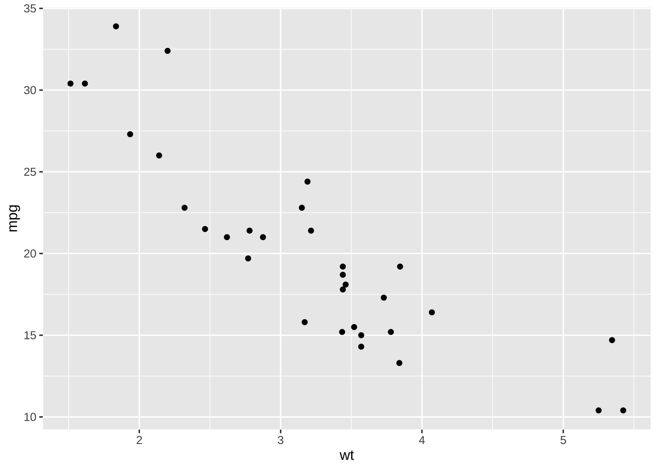
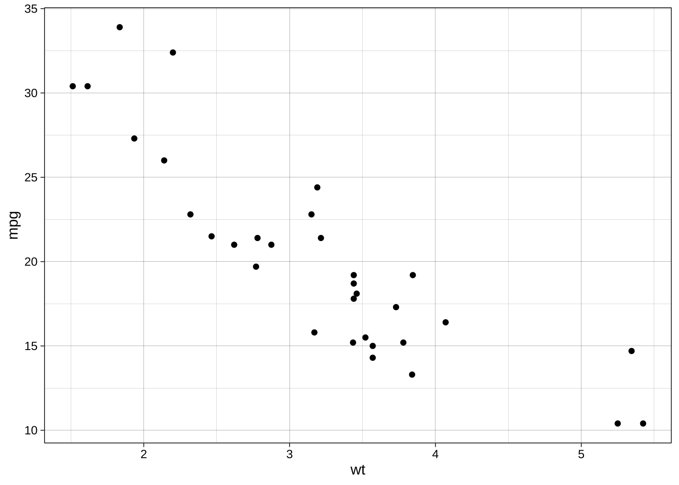
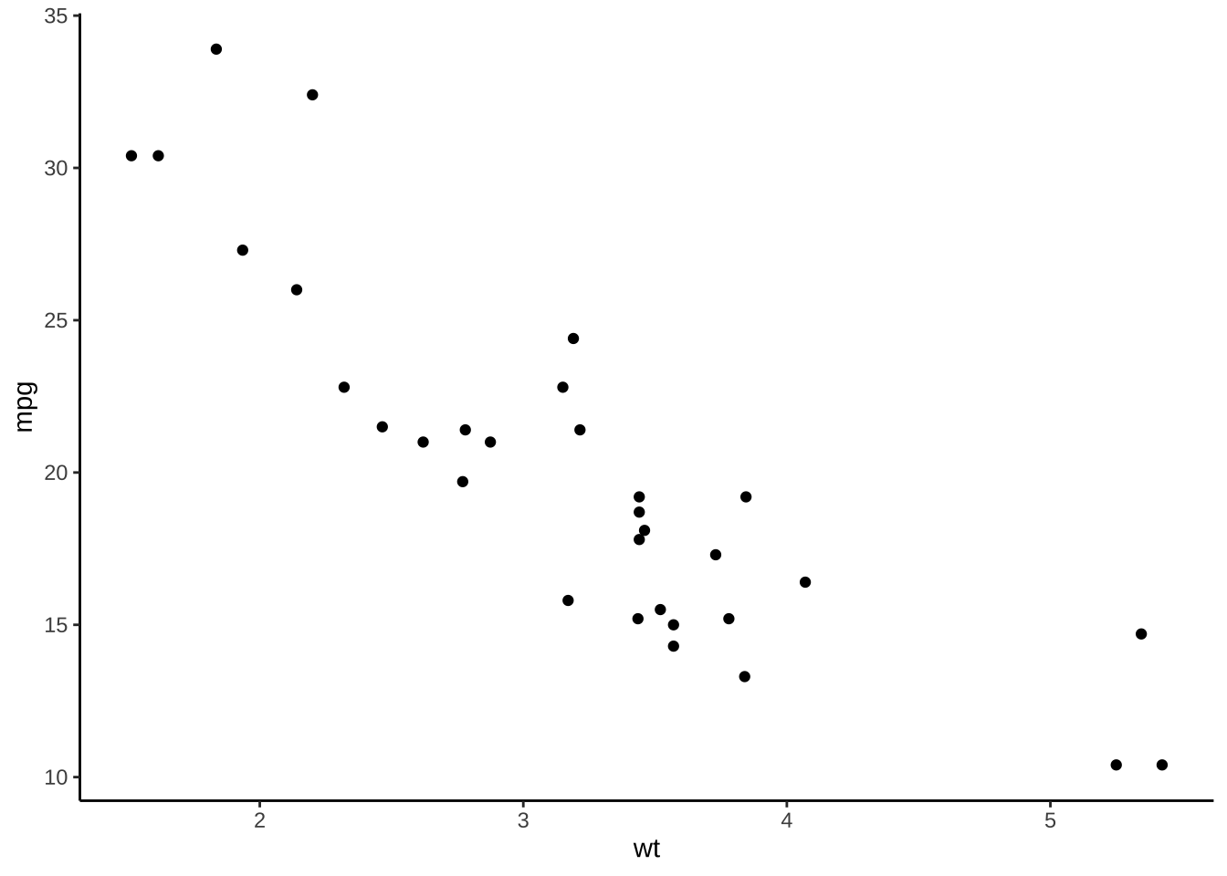
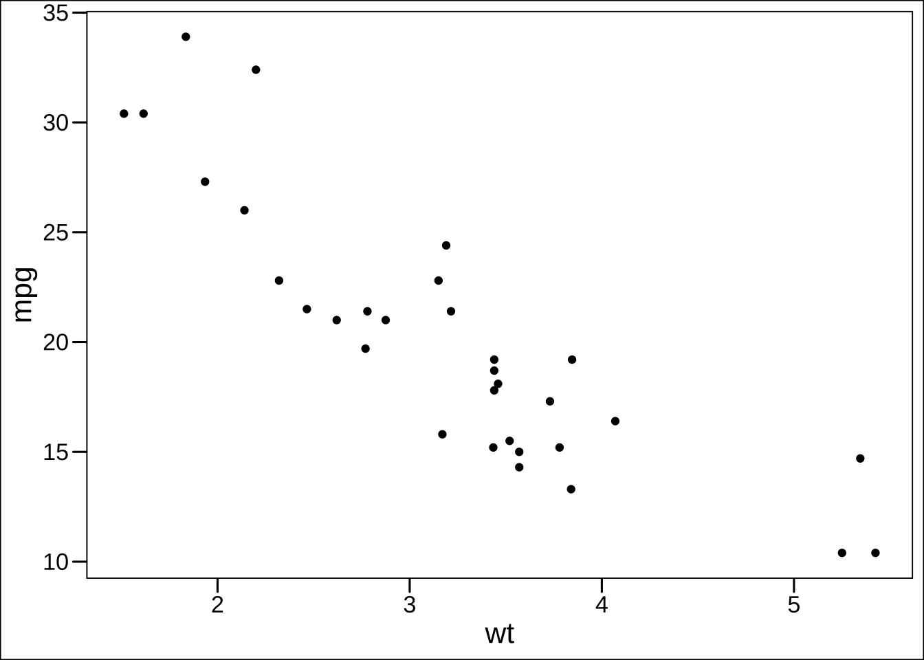
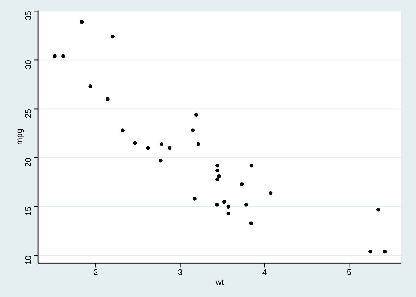
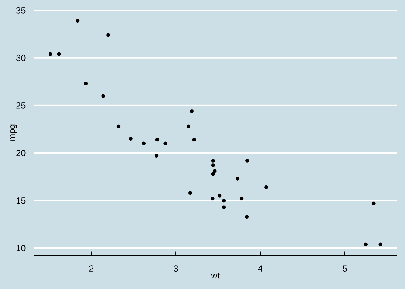
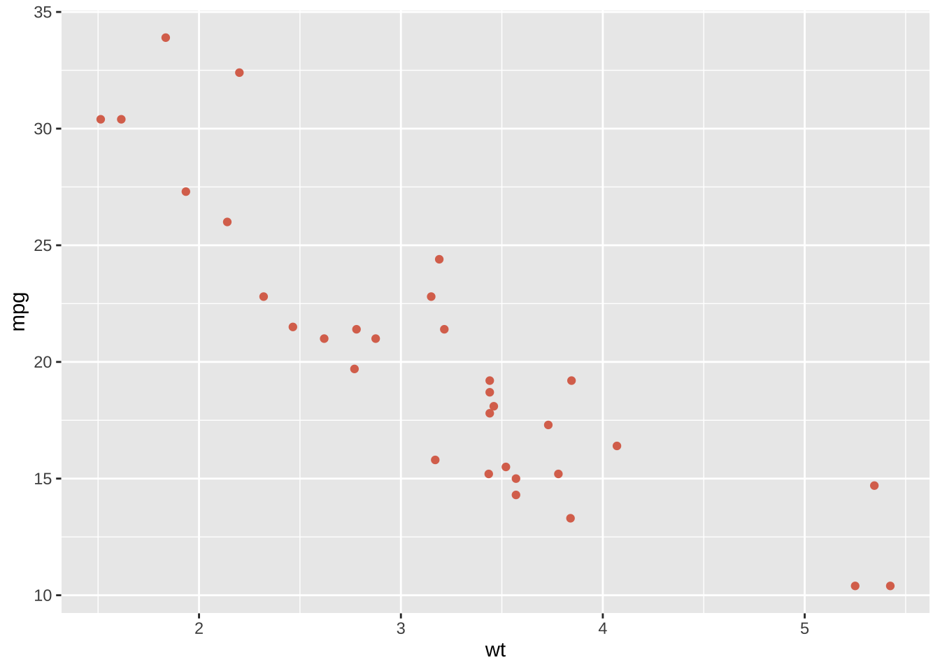
<- ggplot (mtcars) + geom_point (aes (x = wt, y = mpg))+ theme_gray ()
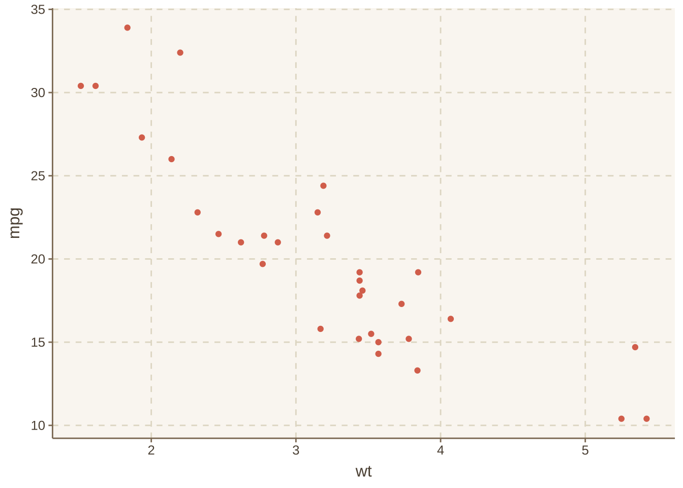
若觉得这些主题仍然不够,一些ggplot的拓展主题包能够实现更多的主题。 - ggthemes - ggthemr - ggtech - ggsci
前两者的应用较为广泛,而后两者主要用于一些特定的场合。
library (ggthemes)+ theme_base ()
这个包内置还有一些内置的颜色
+ theme_calc ()+ scale_color_calc ()
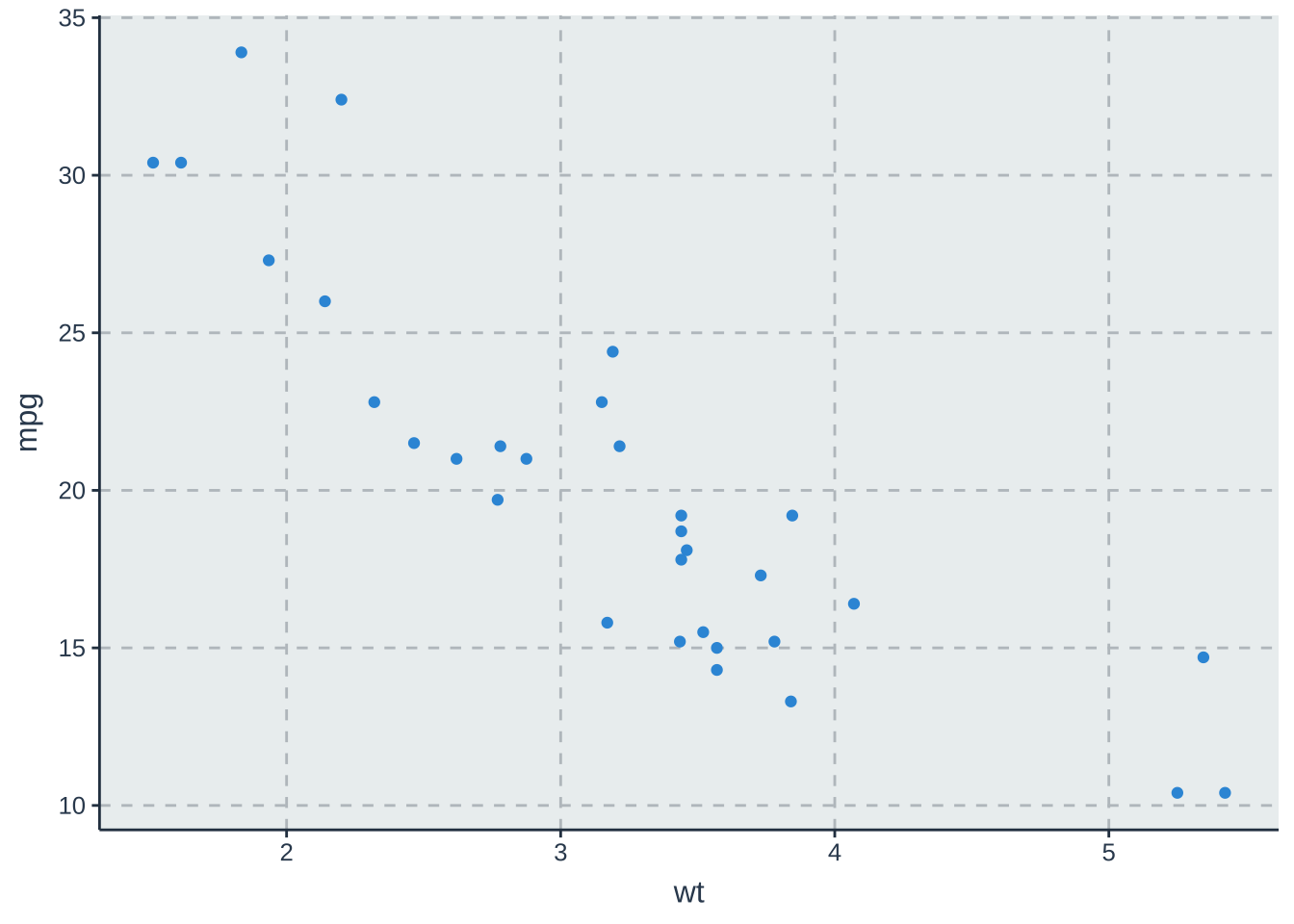
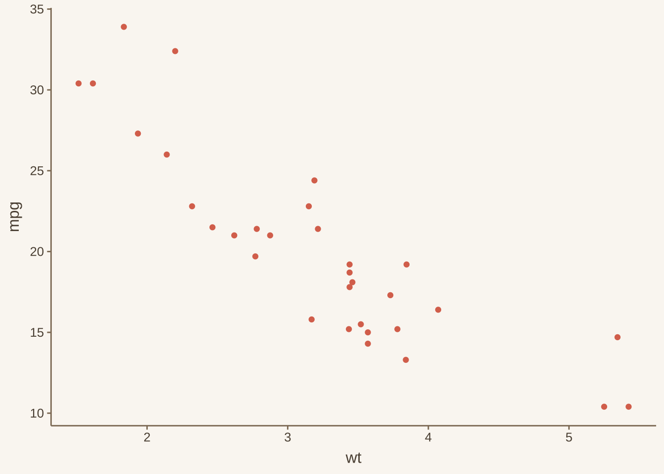
使用ggthemr能够设置更多的主题。 安装是通过github中进行安装。
:: install_github ('cttobin/ggthemr' )而使用方式不同于ggthemes或RColorBrewer与原图进行叠加,而是通过初始主题函数的设置进行实现,这样的好处在于在同一脚本文件下能够统一风格,无需重复设置。
library (ggthemr)ggthemr ('dust' ) # 设置其中一种样式
移除原有初始化的主题风格,恢复默认的ggplot主题和配色方案。
若需要在主题默认下的细节进行调整,通过layout和type等参数的设置就可以实现。
ggthemr ("dust" , layout = "plain" , type = "outer" )
主题细节调整
利用theme()函数,比如,调用panel.grid=element_blank()可设置删除网格线。
axis.text = element_blank())参数可设置删除刻度标签。
+ theme (panel.grid = element_blank ())
其他
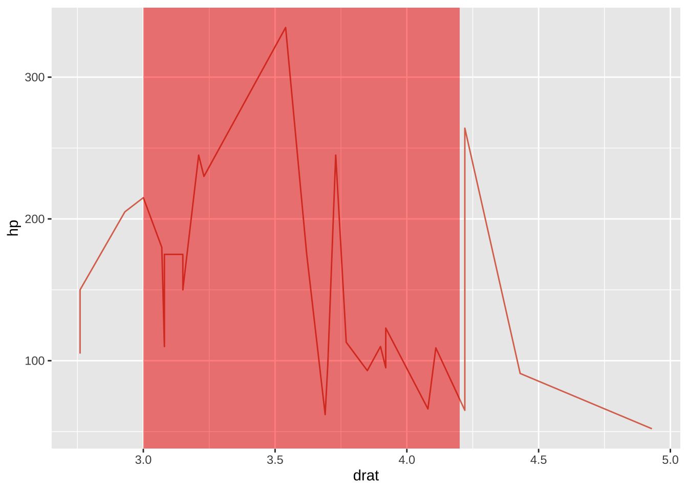
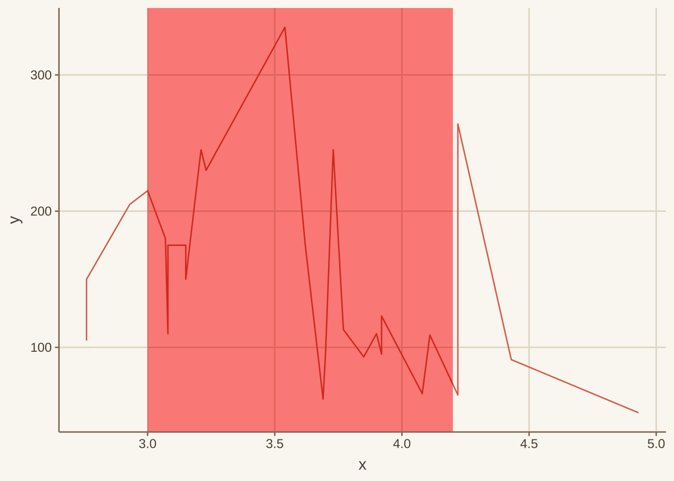
绘制阴影
使用geom_rect(aes(xmin=,xmax=,ymin=,ymax=)),但这个只限于绘制有限个数块状阴影。
library (ggplot2)data (mtcars)ggplot (mtcars, aes (x = drat, y = hp)) + geom_line () + geom_rect (aes (xmin= 3 , xmax= 4.2 , ymin= - Inf , ymax= Inf ),fill= '#FF3300' ,alpha = .02 )+ theme_gray ()#annotate("rect", xmin = 3, xmax = 4.2, ymin=-Inf, ymax=Inf,fill='#FF3300', alpha = .02)
绘制置信区间
这里有一个小trick:使用geom_abline来将所有的线进行填充阴影部分。
<- data.frame (x = 1 : 100 , y = 2 * (1 : 100 ))ggplot (df1) + geom_line (aes (x, y), linetype = 2 ) + geom_abline (slope = seq (1.6 , 2.4 , 0.0001 ), color = "grey60" , intercept = 0 ) + geom_abline (slope = 2 )
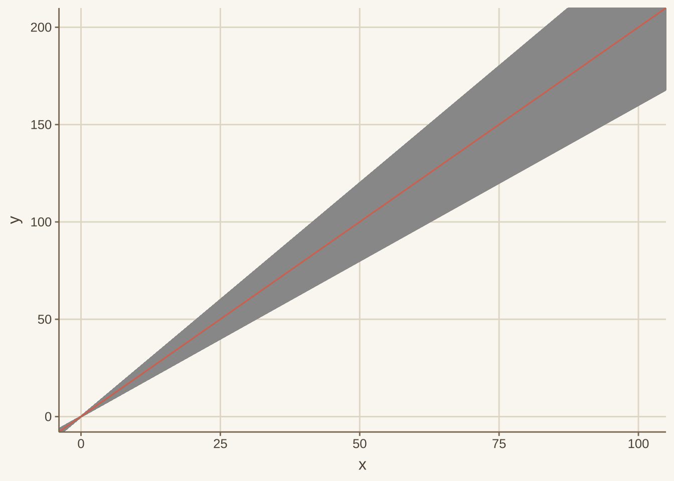
若已知每个数据点的最大最小值,可使用geom_ribbon来绘制阴影部分。
data (mtcars)<- mtcars$ drat<- mtcars$ hp<- data.frame (x= x, y= y, lower = (y+ runif (32 , - 200 , - 100 )), upper = (y+ runif (32 , 100 , 200 )))ggplot (df3,aes (x = x, y = y)) + geom_line () + geom_rect (aes (xmin= 3 , xmax= 4.2 , ymin= - Inf , ymax= Inf ), fill= '#FF3300' , alpha = .02 )#annotate("rect", xmin = 3, xmax = 4.2, ymin=-Inf, ymax=Inf, fill='#FF3300', alpha = .2) + #geom_ribbon(aes(ymin=lower, ymax=upper, x=x), fill = "red", alpha = 0.3)
交互图形
plotly
plotly 是一个功能强大的绘制交互式图形的R包。 安装
install.packages ("plotly" )
Attaching package: 'plotly'
The following object is masked from 'package:ggplot2':

    last_plot
The following object is masked from 'package:stats':

    filter
The following object is masked from 'package:graphics':

    layout
<- ggplot (faithful, aes (x = eruptions, y = waiting)) + stat_density_2d (aes (fill = ..level..), geom = "polygon" ) + xlim (1 , 6 ) + ylim (40 , 100 )ggplotly (g)
Warning: The dot-dot notation (`..level..`) was deprecated in ggplot2 3.4.0.
ℹ Please use `after_stat(level)` instead.
ℹ The deprecated feature was likely used in the ggplot2 package.
  Please report the issue at <https://github.com/tidyverse/ggplot2/issues>.
其中的ggplotly就是将静态的ggplot()转换为动态的形式。
plot_ly (z = ~ volcano, type = "surface" )
其中的函数plot_ly能够将R映射到plotly.js 上。
散点图
plot_ly (Orange,x = ~ age, y = ~ circumference, color = ~ Tree,type = "scatter" , mode = "markers"
函数的参数设置与ggplot类似,一些差异的是在将变量映射到不同元素时候,其存在一个波浪符号x=~attr1,y=~attr2,color=~attr3。
条形图
Attaching package: 'data.table'
The following objects are masked from 'package:dplyr':

    between, first, last
The following object is masked from 'package:purrr':

    transpose
<- as.data.table (diamonds)<- diamonds[, .(cnt = .N), by = .(cut)] %>% #通过%>%传递参数 plot_ly (x = ~ cut, y = ~ cnt, type = "bar" ) %>% add_text (text = ~ scales:: comma (cnt), y = ~ cnt,textposition = "top middle" ,cliponaxis = FALSE , showlegend = FALSE <- plot_ly (diamonds,x= ~ cut,color= ~ clarity,colors = "Accent" ,type = "histogram" )
需要注意区分的是color与colors参数,前者是映射对象,后者是整体色调设置。
折线图
plot_ly (Orange,x = ~ age, y = ~ circumference, color = ~ Tree,type = "scatter" , mode = "markers+lines"